清石作品
Works
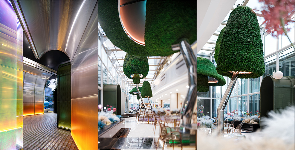
Starbucks coffee service specialty shop - Wudaokou Universe Center Magic Garden
“宇宙中心的奇幻花园”—北京五道口星巴克咖啡服务特色店
童话照进现实,鲜花与浪漫接踵而至;在奇幻花园里,开启一段奇幻的爱丽丝梦北京海淀区的五道口,曾经被戏称为“宇宙中心”,这里顶流高校林立,知名企业扎堆。项目位于五道口的核心建筑之一东升大厦,这是20年来大堂外挑采光厅的第一次升级。改造后的大堂主要提供星巴克咖啡服务,奇幻的各式植物和花卉,绽放在北方最为稀缺的四季花园里,最为引人驻足流连。威尔士诗人迪伦·托马斯曾用一句诗描述花园带给人的幸福与安宁。“由绿的生命引信引爆的力量,震动着花朵。”被绿植物填满的阳光房,即使在寒冷的冬日,仍能感受春日般绿意盎然。童话故事里总是会让人惊喜的水景和动物们,都是藉由现有的条件升级而成。爱丽丝的白兔先生换了装,兔子+乌龟的组合是永恒的童话主题...正在缓慢上爬的蜗牛也加入了兔子和乌龟的组合,一起放慢了时光的脚步。巨型的植物在空中化身为艺术装置,向阳花在半人高的视线上昂首挺立,似乎在歌唱。地被层则是由各式各色的薰衣草覆盖装点。花艺师眼中的花朵与诗意,包含着东方式的美学思索。每一组花都经过花艺师们精心挑选和搭配,将自然元素与现代设计理念相结合,展现出最佳效果,显得更加奇幻而自然。阳光厅通过一个专属的通道直接与外部相连,这是一段通往奇幻花园的探险之旅。覆上彩色渐变膜的阳光板墙,在玻璃砖地面与灯光的衬托下,让探险之旅更加神秘而华丽。这是一次最大限度基于现状的更新升级,力求能以一种艺术、趣味、格调合而为一的方式,提升大堂乃至整栋商务楼宇的品质,也希望能够成为宇宙中心的又一处奇境幻梦。项目名称:东升大厦大堂吧升级改造项目地址:北京市五道口设计机构:QUCESS清石设计实施机构:QUCESS清石设计项目主持:李怡明主案设计师:王学丽、胡坤、杨一诺设计团队:平凡、李亮、徐照斌、张志浩、丁亚男、王巍、刘奇、高赞实施负责:王磊实施团队:高赞、李慧、李莎莎、王欢、罗云、李雅高、朱凤响花艺负责:朱文杰设计时间:2022年项目面积:430㎡项目摄影:UOHO 建筑空间摄影陈军
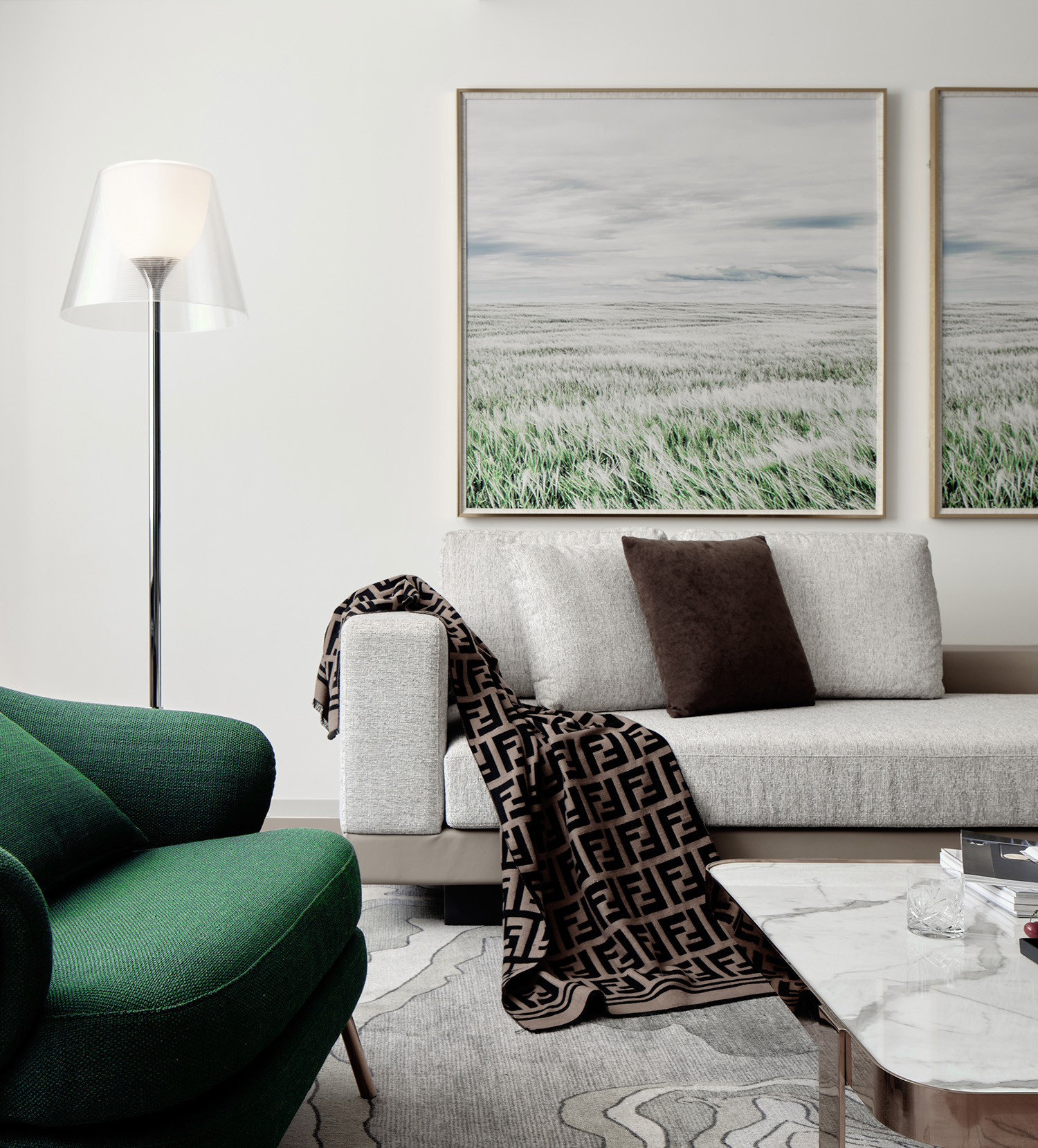
随心呼吸,潜入自然与科技交织的“无风感五恒”公寓
柏穗公寓
Dense silent falling blue sky, rain rain dance rhyme breeze——Son LAN《The snow》密密无声坠碧空,霏霏有韵舞微风。——子兰《对雪》 柏穗公寓采用辐射空间空调系统,达到新五恒标准,室内没有空调出风口,告别传统。通过建筑内表面温度的控制,模仿一个山洞环境,让人回归最自然的生活环境。 美好的居住环境常以自然作为依托,山石林叶点缀在室内空间更是落笔生辉。巧借自然之妙,以艺术造境,拥怀天地,使石之韵、林之美在此演化成东方美学的舒适,而舒适的本质是科技的力量,当自然臻境偶遇现代科技,空间的舒适主义再度被诠释。城中市井喧嚣,都市人潮熙攘,自然和科技完美交织之境则宁静致远,通透与清雅于此呈现,亦迭新出柏穗公寓对东方人居哲学的新理解。 入境·隽永 设计师精研空间自然美学,以山石林木为灵感,营造衔接室内的第一会面空间。大地色系弥漫贯穿于整个空间之中,描述一种自然臻境的包容之美,大方无隅,使人感受舒适安宁。绿色大理石与繁花绿叶相得益彰,空灵隽永之感引人驻足、探索,感叹于自然的神奇、奥妙。 自然元素与现代科技的相互碰撞交融,更添魅力。柏穗辐射空调智能系统,恒温、恒湿、恒氧、恒洁、恒净,在无风感的环境下,也许你可以在此片刻地开启心灵瑜伽时间,将身与心自然地在空间中安放、舒张,感受这独特意境的魅力。 时序·自在 与君初识,会客有道,在乎交互空间的张弛力道。设计师以一片自然意境融合初见的美好氛围。绿叶繁花盈盈熠熠,仿佛生命在自然中舒张的姿态,充盈着力、劲、道之美。整体空间线条利落分明,使观览者自在随心,会面柔恰。杯盏交谈间,城市的喧嚣被无形抚平。 温柔·静谧 设计师引景入室,使内部空间与自然共生,营造温馨、舒适的氛围。木质与绿植元素的引用古朴、自然、温和。居室厚重而诚挚,大自然像位艺术家,呈现了自然的柔美画卷。在遁隐于尘世的艺术美,自然居境浑然天成。 交织·元素 自然元素的大幅运用极具感召力,构筑纯粹、精致、唯美的微妙空间。流动的自然氛围与科技完美相融,以空灵清隽的建筑空间匹配城市雅仕身份,在静谧中凝练思考,品、味、格皆得以升华。 绿色元素带来的自然、和雅、清澈、深满质调,在木质地板渐次传递,荡漾起空间的起伏情绪,引人陷入安静冥想,雅致的关怀,自然而然,展示以一份宁静。金属现代感点缀装饰,交织构造各种线条,玩味出空间仪式感,让人体味温馨、细腻的空间情绪。 奢意·风雅 盥洗室布置清洁而素雅,传递一份温馨、洁净的贴心感受。不同层次质感的白、蓝、木色相得益彰,素淡,却也丰盈有度。都市的风雅,原来不在雍容华贵的堆砌,而是自在落拓、收放得宜的精神品质。 这是一种自然语境下的“轻奢”,一种自然与科技并蓄的现代奢意,浸染清新的时尚、精致与风雅。 在此,你可以有短暂的停歇。在繁忙的城市生活中,照见心灵,完成一次与自己的对话…… 项目信息 项目年份:2020年项目面积:150㎡主创设计:王学丽、胡琨设计团队:张志浩、刘伟、张傲颜深化团队:韩张生软装团队:罗云摄影师:陈军Tags:一抹绿意于空间中,自然、健康、优雅的都会生活艺术、有繁而华之,也有从容闲暇的惬意

Daxing international Hydrogen Energy Demonstration Zone Incubator
大兴国际氢能示范区孵化器
本项目位于大兴国际氢能示范区,QUCESS设计团队通过阐述人与科技之间的和谐相连,从而创建了一个培养协作、创新、生产力和幸福感的灵活工作空间,让创造力、专注力得以融合。 共享·自由 温暖舒畅的空间 丰富多样的趣味设计师将多功能空间赋予了共享、自由的力量,将暖色定为空间的基调,让入口处各功能空间处于环形动线上,让人们享受共享活动空间的同时,保有自由的舒畅感。入口设置多功能复合空间,兼容各场景功能需求,预留弹性变化。既是办公空间的一部分,提供多元化的办公选择、为商务接待和小型会议提供灵活空间,同时也作为办公区的“共享会客厅”,兼做开放的会议空间,或作为企业内部的宣讲、宣传等活动场地。工作咖啡区是一个具有整合功能性的开放互动空间。充满情怀的咖啡区、精巧别致的私人交谈区,在整个办公环境中,你会感受到一股“笃悠悠”的慢调,将传统、固定、单一的功能转化为人们相互联系、同时助于协同工作和激发创意的新型空间。设计师以家具的形式取代传统的墙体思维来构建这片区域,低矮的隔断配以通透的金属架构,让这里形成一片开阔的视野。这样一个具有开放性和扩展性的空间,既是温馨舒适的休憩场所,又是活力多元的互动空间。 开放·高效 灵活办公的区域 随意交谈的契机唯美的莫兰迪配色,为办公区增添一抹艺术的色彩,在统一的灰白色裸顶和中性地面的背景映衬下、裸露的设备管道、低饱和度的金属网格隔断、多彩的家具配饰,让整体空间清新、明亮、开敞、流动。传递出令人愉悦的工作氛围。活用巧妙设计去构筑亲切氛围,小型会议和讨论空间穿插在开放办公空间中间,功能互相渗透,让办公空间不再孤立,为整个空间提供源源不断的活力。 创造·连接 灵动独特的气息 互动交融的时空整个空间设计通过灵动、趣味的弧形廊架、金属网,模糊室内和室外的界限,让自然环境与高效工作和谐相融,打开了一种新的工作和生活方式的视角。人性化的功能配置,比如,睡眠舱、电话间、mini会议吧,满足办公人群的各种需求。让工作、生活、企业、同事之间进一步建立密切关系,多样的配置让办公空间拥有更多期待。丰富的场景规划让快乐工作无处不在。从各类休闲区到舒适性的会议空间、露台空间,从飘香的咖啡吧到高效的工作区,各种协作空间都应有尽有,在办公空间中,突破边界却又合而为一的理念,让生活和工作的各种可能性向无限处延展。

Zhongguancun Shaoxing Shuimuwan Science Park
中关村·绍兴水木湾区科学园书店项目
一个理想的上午总是这样展开捧一杯咖啡,阳光下阅读,偷得浮生半日闲的慵懒;一个效率的下午总是这样展开思维枯竭毫无灵感,在书店寻找智慧,高效率的完成工作;一个无聊的晚上总是这样展开听说喜欢的作家要来参加读书会,欣然而至,于是认识了许多志同道合的朋友。始于颜值 忠于体验网红书店坦然地向消费者展现了:读书也是一件很“美”的事。以“咖啡+生活方式+第三空间+书店”的概念形成了当下书店的成功的公式。作为书店资深体验者的设计师认为,颜值只是这些书店成为网红打卡圣地的敲门砖,能一直成为年轻人心目中的宠儿更深层次的原因是:这些书店卖的不是书,卖的是场景体验。本案项目位于“中国硅谷”,中关村绍兴水木湾区科学园,整体面积约2100㎡。陈列区,阅读区,储藏区比例 5:4:1,在商业模式当中,书店创造出来的舒适空间体验,让消费者能更好地与人交流、思考,逐渐变成了家和公司之外的第三种去处。书的气质的陈列,空间里内容的营造,以及精心挑选的商品从而营造出一种新的消费场景。场景营造×园林意境×文学意境首层借鉴用中国古典院落布局,中轴对称、方正严整的布局,植根于深厚的传统文化,形成书院文化的底蕴。并且每一本书都应该可以很方便地被触碰、翻阅,而非把书籍用作装饰,这是对于书籍最基本的尊重。用薄木片串成的艺术装置,形成书店的记忆,一人、一书、斑驳的灯光有一丝侠客气氛。二层采用曲线异形的灵动布局,与首层形成对比关系。借鉴绍兴山水自然形态,仿佛游走在书的山水之中。苏东坡说过,宁可食无肉,不可居无竹,文人雅士对竹子的喜爱由来已久。因此本案以“竹林赏书”为灵感营造一种文人雅士的书店。蜿蜒的竹林拥有线条之美,亦有流水曲觞之感,然后是下沉式阅读区,亦可作为雅集活动分享区,形成了A面书店,B面生活方式体验店。上帝就在细节里空间色彩以黑白灰为基调,穿插木色和现代的金属色,用自然的材质和现代工业感的材质对比,致敬经典,传承经典。童书绘本区在自然光线可以洒进来的区域里,书架高度恰好是读者抬手可触及的位置,较矮的梯步与灯带都恰到好处。史蒂夫·乔布斯说:创意就是把所有微小的点连接起来。然后平静淡然,向文字和生命提出了平等对话的邀请。设计本案不仅要对材质的语言进行解读,并且还要对阅读者的注意力进行抓捕,这个世界上所有的技法都可以学,但唯独思想学不来。在艺术、在科学、在宗教里去寻找,在历史、在哲学、在文学抑或在日常生活的点点滴滴里去寻找;他们相信生命的答案就在书籍里,竹林里,和光同尘,与时舒卷,阅读如见面。
Qingdao Citizen Center
青岛市民中心
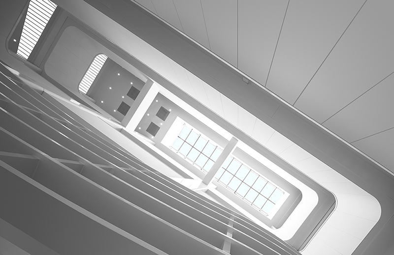
当建筑不再只是建筑本身,而与城市功能搭脉相连,都市生活也就谱写出了更多的多样性。青岛市民中心是清石设计与北京中景昊天工程设计有限公司对于建筑改造与城市更新的又一个实践项目,同时也是室内与建筑的新陈代谢设计理论又一次输出和实践。起点——如何将废旧商场改造为市民中心?青岛市民中心由一栋空置近十年的商业建筑改造。原商场由一栋11层塔楼和4层裙楼组成,建筑之前的功能是商场,层高较低同时空间进深小,整体比较狭长,跟市民中心需要的大尺度公共空间,在空间尺度与使用上差别较大,加上项目周期短预算紧,如何才能将市民中心的功能有效融入原有的商业空间?以及梳理出流畅的空间功能流线和舒适的空间体验?改造后的青岛市民中心集中了二十多家市级委办局将在此集中办公,为全市居民、企业提供包括民生、社保、税务、公安、出入境、公共资源交易、投资建设、市场准入、社会综合管理等提供一站式服务。空间改造功能需求的复杂性可想而知,如何对待平衡旧建筑与新需求的关系,为市民提供真正的便利,成为设计思考的起点。清石设计给出了诗意且富有哲理的回答:诗意:光的对面是彩虹。将自然光引入室内空间,同时彩虹渐变作为基础配色元素植入室内空间中。哲理:奥卡姆剃刀定律(Occam's Razor, Ockham's Razor)又称“奥康的剃刀”,这个原理称为“如无必要,勿增实体”,即“简单有效原理”。改造策略——办事大厅小型化我们提出市民服务大厅的改造策略是:大厅小型化,在保持原有空间结构的基础上,通过灯光、导视系统和空间色彩将不同的办事单元串联在一起。同时办事大厅小型化让空间尺度更加亲人,为市民们在办事大厅等候或者办理业务营造一种在家的亲切感。办事大厅的“客厅化”设计风格创造舒适、宁静的室内空间氛围,满足市民在等待过程中的心理需求。等候区家具挑选的原则是能够让人们在这里呆更长时间,因此我们为市民提供多样性的选择,但是只有一个舒适的目标。改造策略——以空间色彩组织流线我们不仅仅是将一个大结构体分解成一系列组合体的整合,更重要的是创造多种级别的空间和不同环境的相互渗透。这种相互交织的空间组织,满足更多向的互动交流的同时,也使空间利用更有效便捷,为更多种形式的活动提供灵活的环境支持。市民服务大厅的功能组织与各种活动息息相关,所以简洁、清晰的流线组织以及明显的等待区域设计都至关重要。我们希望通过室内色彩设计为使用者提供清晰明确的室内引导。因此我们将彩虹渐变作为基础配色元素植入室内空间中。不同楼层的标识、窗口指示牌以及家具都遵循统一种色彩渐变原则,这样的空间色彩搭配从潜意识中引导市民快速准确的定位自己所在的位置,引导他们到达最终的目的地。在动线规划方面,因原始建筑属性为商业空间,交通疏散设置较多,针对新的功能需求,我们通过梳理专家流线、行政审批内部流线、投标人流线、综合大厅办事人员流线以及综合大厅等五条重要流线,将裙楼东侧的部分电梯及楼梯在满足消防规范前提下做了适当的拆除,以提高空间的利用率。同时增加专用电梯,同时将主扶梯在竖向空间维度延长至顶层,充分满足了竖向的交通连续性需求。改造策略——引“光”入室项目本身作为大型公共服务空间,职能空间本身已经被赋予了“阳光”“开放” 的公众印象和标签。因此充分的自然采光似乎是市民中心必备的精神气质,为了契合公众对市民中心的潜在期待,我们在原商场建筑的三个中庭上设置了大面积的天窗,让阳光能够通过中庭洒向室内。通过重新规划墙体分隔和竖向交通让室内空间获得更充分的自然采光,配合人工光带的分布,让空间符合市民对大型公共服务空间的期待。改造策略——细节体现品质改造设计过程中,设计师充分考虑工作人员办公环境的优化。合理的采光设置,工作休息区的结合,人性化的办公家具选择,空间绿色的植入,这些都让长时间在这个空间中的工作人员有舒适的办公环境,优质的环境与优质的服务相辅相成。在材料语言的解读上,我们使用颜色编织地毯、定制编织地毯、超白钢化背漆玻璃、白色烤瓷铝板、木纹转印铝板、仿地毯地砖、木纹铝吸音板等经济牢固的材料,渗透在观者的感官里,以诉说着城市的沧桑岁月和文化内涵。每个人对青岛这座座城市,都有深深的理解,环境亦如斯,建筑亦如斯,室内空间亦如斯。后疫情时代人类将要面临的诸多课题,这是后疫情时代带来的深邃思考,是人类文明走向“重生”的过程,实现以眼观,以心去觉察,去感叹经过重新设计规划的市民中心,恢复了往日的活力,相信好的设计能够不断自我更新,为城市赋能。空间以它的方式和力量为都市人注入能量,在轻微却不间断的新陈代谢中,塑造新生。When architecture is no longer just a building itself, but is connected to the city's functions, urban life, this also composes more diversity. Qingdao Citizen Center is another practical project design of Qingshi Design and Beijing Zhongjing Haotian Engineering Design Co., Ltd. for architectural renovation and urban renewal. It’s also another practical output of interior and architectural metabolism design theory.How to transform an old shopping mall into a Citizen Center?Qingdao Citizen Center was transformed from a commercial building that had been vacant for nearly ten years. The original shopping mall consisted in 11-floor tower and a 4-floor podium, the previous function of the building was a shopping mall, the floor height is not high and the space depth is small, overall is relatively narrow and long, the large-scale public space needed by the citizen center is quite different in terms of spatial scale and use, coupled with the short project cycle and tighten budget - how can the functions of the citizen center be effectively integrated into the original commercial space? And how sort out the smooth spatial function streamline and comfortable spatial experience?More than 20 Municipal Committees and Bureaus will be concentrated in the reconstruction of Qingdao Citizen Center, providing people’s livelihood for residents of the city, social security, taxation, public security, immigration, public resource transactions, investment construction, marketing access, providing one-stop service for comprehensive social management and much more. The complexity of the functional requirements of space reconstruction can be imagined, so how to balance the relationship between the old buildings and the new requirements, providing real convenience to the citizens, became the starting point of the design idea.Qingshi Design gave a poetic and philosophical answer:-Poetry: Opposite the light is the rainbow. Natural light is introduced into the indoor space, and the rainbow gradient is used as a basic colour element to be implanted in the indoor space.-Philosophy: Occam's Razor Law is also known as “O'Connell's Razor", this principle is called "if not necessary, do not add entities", that is, "simple and effective principle".Strategy: Miniaturization of the office hallWe propose that the transformation strategy of the Citizen Service Hall is: The hall is miniaturized, and on the basis of maintaining the original spatial structure, different service units are connected in series through lighting, guidance systems and spatial colours. At the same time, the miniaturization of the office hall makes the scale of the space more relative, creating a sense of intimacy at home for citizens waiting in the office hall or handling business.The "living room" design style of the office hall creates a comfortable and quiet indoor space atmosphere and meets the psychological needs of the citizens in the waiting process. The principle of the selection of the furniture in the waiting area is to allow people to stay there longer, so we provide citizens with a variety of choices, but there is only one comfortable purpose.Strategy: Organizing streamlines with spatial coloursIt is not only decomposing a large structure into a series of integrations, but more importantly, creating multiple levels of space and mutual penetration of different environments. This mutually mingled space organization meets more directional interactions and, at the same time, makes space utilization more efficient and convenient, and provides flexible environmental support for more types of activities.The functional organization of the citizen service hall is closely related to many activities, so concise and clear streamline organization and obvious waiting area design are essential. We hope to provide users with clear and easy-going indoor guidance through indoor colour design. Therefore, we use the rainbow gradient as the basic colour element to implant the indoor space. The signs, window and furniture on different floors all follow the same colour gradation principle. Such spatial colour matching subconsciously guides citizens to a quickly and accurate perception of their current location and guide them to their final destination.In terms of traffic planning, since the original building is a commercial space, there are many traffic evacuation facilities. In response to new functional requirements, we sorted out the streamlines such as expert streamlines, internal streamline of administrative, bidder streamline, five important circulation streamlines, including the staff streamline of the comprehensive lobby, some elevators and stairs on the east side of the podium were properly demolished under the premise of meeting the fire protection regulations, also, in order to improve the utilization of space, at the same time special elevators are added, and the main escalator is extended to the top floor in the vertical space dimension, which fully meets the demand for vertical traffic flow continuity.Strategy: Bring "light" into the roomThe project itself is a large-scale public service space, and the functional space itself has been given the public impression and label of "sunshine" and "open". Therefore, sufficient natural lighting seems to be a necessary spiritual temperament for the Citizen Center. In order to meet the public's potential expectations for it, we set up large skylights in the three atriums of the original shopping mall building to allow the sunlight to spill into the interior through the atrium. By re-planning the wall partition and vertical traffic, the indoor space can get more natural lighting, and with the distribution of artificial lights, the space can meet the expectations of the public for large-scale public service spaces.Strategy:Details reflect qualityIn the process of renewal of the design, the designer team fully considers the optimization of the staff’s office environment. Reasonable lighting settings, the combination of work areas with rest areas, the selection of user-friendly office furniture, and the green implantation in the space, all enable the staff, who have been in this space for a long time, to have a comfortable office environment. The high-quality environment and the high-quality service complement each other.In the interpretation of material language, we use colour woven carpets, customized woven carpets, ultra-white tempered back-painted glass, white porcelain aluminium plates, wood grain plates, imitation carpet of floor tiles, wood grain aluminium sound-absorbing panels and other economically strong materials. Infiltrating the senses of the viewer to tell the vicissitudes of the city and its cultural connotations.Everyone has a deep understanding of the city of Qingdao, the environment is the same, the architecture is the same, and the interior space is the same. The many issues that mankind will face in the post-epidemic era is the profound thinking brought about by the post-epidemic era. It is the process of human civilization’s "rebirth", realizing the realization of seeing and perceiving with the heart, and lamenting the redesigned and planned Citizen Center, restoring the vitality of the past, and believing that good design can constantly renew itself and empower the city. Space injects energy into urbanites with its way and power, and creates new life in a slight but uninterrupted metabolism.

Zhongguancun Digital Economy Innovation Industry Base
中关村数字经济创新产业基地
到处都有艰难的航程和同样的星星。但这片花园就在我的窗外。——卡佛 《花园》学清路站在中关村核心区及清华北大两公里半径范围内,这里作为互联网企业聚集地,工业时代遗留的老厂房悉数拆除更新,机电研究所是其中为数不多的幸存者之一。本次挑战是新兴的互联网及科技企业。他们需求的是最大化的办公面积,但同时还要有良好的通风采光环境以及高品质、活跃的空间氛围。业主对于项目的定性是以室内改造为主。但我们却将关注点放在了项目之外。结合入口的位置,我们用圆形将整个厂房一分为四,融入到周边的环境中。1.自由花园面对新兴的互联网高技企业客户,需要在诸多不利条件下——有限预算、粗放结构、高新需求,如何利用现有条件实现最大化办公面积,并使建筑保有良好的通风采光环境及高品质、活跃的空间氛围成为至关重要的问题。项目之外——既包括厂房周边环境,同时包括厂房屋顶和原有地面以下的结构空间,结合建筑入口的位置,用圆形将整个厂房一分为四,融入到周边环境中,又在确保安全的前提下,将空间高度及屋顶价值利用至极限。“我们希望每个办公区都像被花园所围合,让互联网企业人员在工作之余望向窗外,便即刻获片刻轻松,当然,也可以直接步入花园,享受阳光与自然的气息。”2.仰视天光从入口进入后,能看到大面积被扩建改造的采光天窗,光从此进入引导行进的方向。采光天窗一直延伸至与中庭连为一体,中庭花园沐浴在自然光线中。时间行至傍晚,灯光依旧温暖,天窗反衬出蔚蓝星空。中庭的后半部分保留了旧建筑的部分天窗,使新的空间使用者能够感受到原有厂房中独具特色的印迹。3.空间张力由于整个项目东西尺度较长,设计师在中庭间隔设计了两部不同形态的旋转楼梯分散组织人流动线,并起到活跃空间氛围的作用。旋转楼梯附近,两组开敞型的观光电梯与步行梯相呼应,同时采用明亮的色彩涂装结构钢架,形成中庭的视觉焦点,共同组成交通核心。艺术化的螺旋楼梯能与工业化的观光电梯相互对撞,令整个空间充满生机与活力,为上下的旅程增添一份趣味。在午后阳光里,新旧部件相遇,散发迷人光影。4.星空花园为了最大化提高使用率,屋顶几乎承担了整个建筑的所有机电设备。于是,设计师见缝插针地在原有建筑的斜屋面上设计了休闲与聚会两个风格功能迥异的屋顶花园。花园中心设计太阳能自发光座椅及叶片、羽毛形态的艺术装置,夜晚漫步时,互联网人的思绪也可以随时飞舞起来。我们不仅希望使用者的窗外有一片花园和星空,也希望周边的建筑和使用者感受到这片花园和星空。“老厂房改建中,保证建筑和结构安全始终是项目核心。如何最大限度地利用现有建筑和结构条件,则是项目得以低造价建成的关键。“ 特此感谢中国建筑科学研究院有限公司,给予我们许多关键性支持和帮助。对于我们来说,这是一个各方面都极具挑战性的改造项目。有幸得到业主的全力支持和施工单位的全力配合,本项目得以最终落地。
Dongsheng Science Park Series
东升科技园
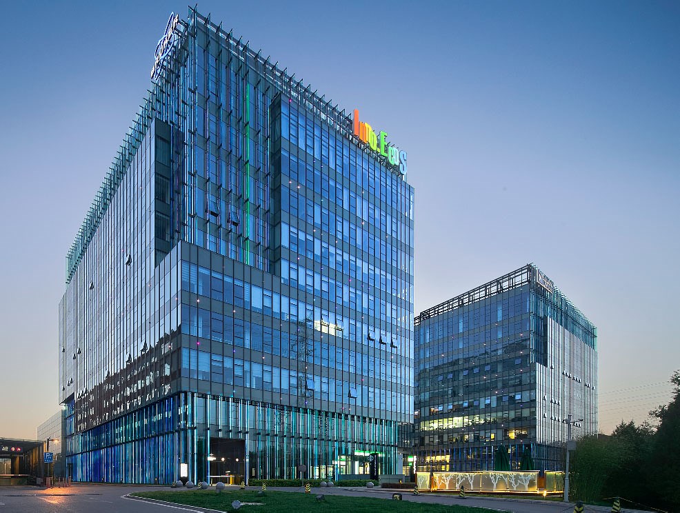
本项目中清石设计为业主提供了全案设计服务,全面配合业主运营管理周期,分阶段提供设计服务,可持续定制化的设计服务使业主得到充分的技术支持。与业主一起将东升科技园区打造成为汇集总部基地、高科技产业研发基地、加速器及企业孵化基地、高科技成果及相关配套服务为一体的国内一流生态型综合园区。设计改造完成至今,东升科技园区已成为目前中国单平米产值最高的科技园区之一。 In this project, Qingshi Design provides the owner with the whole case design service, fully cooperates with the owner's operation and management cycle, provides design services in stages, and the sustainable customized design service enables the owners to receive full technical support. Together with the owners, Dongsheng Science and Technology Park will become a domestic first-class ecological comprehensive park integrating the headquarters base, high-tech industry research and development base, accelerator and enterprise incubation base, high-tech achievements and related supporting services. Since the completion of the design and renovation, Dongsheng Science and Technology Park has become one of the highest-tech parks in China.

Zhongguancun Chuangye Street·Taili Station
中关村创业大街·泰利驿站
在中国创新创业资源最为密集的中关村核心区域,全长仅220米的创业大街如同这座城市中一条汩汩流淌的血脉,涌动着为高速奔跑的城市输送氧气。2020年9月,由清石设计改造完成的泰利驿站中关村大街站在创业大街北口落成,这座24小时对外开放的复合空间向城市和穿梭其中的都市人提供了一个不同以往的落脚处,除了显而易见的功能空间以外,它更像是一个小型能量泵,为城市的一呼一吸注入能量,共同完成它日复一日的新陈代谢。同时,这也是清石设计新陈代谢设计观的一次全方向实践。空间之于城市,一呼一吸之间,一次微新陈代谢.当新陈代谢的设计理念被设计师注入空间重建时,泰利驿站便不再只是街口的一座新空间而已。设计师保留了原空间的大部分骨架,在旧有基础上进行了空间的延伸、重构,将其改造为结合了开放、半开放与封闭区域的新空间。从室外步入室内的过程,情绪也从喧闹过度到舒缓平和,直到整个复合型空间完全呈现在眼前,你便可以挑选中意的区域落脚。对于吐故纳新的泰利驿站来说,再设计的过程本身就是一次空间的自我新陈代谢,而一座新空间的诞生之于城市,也是一次微小却力道精妙的更迭。这个正缓慢新陈代谢的复合庭院就像一座迷你城市,繁忙的都市人进入其中,在交错层叠的微景观里舒缓精神;在物理赋能的设施辅助下补充体力;在精心设计的场景中按下时间的缓慢倍速按钮……再次出发时,人们轻装简从、眼神明亮,这是一处微小空间对城市的贡献,而城市也在这样的焕新和赋能中,完成着属于它的新陈代谢。空间之于人,一呼一吸之间,一次减“负”与“赋”能.为了让空间达到为人们“减负”从而“赋能”的效果,清石设计将丰富的功能和使用场景恰到好处地植入空间,并利用清新简洁的色彩使用和景观叠加进行强化。小型分享区、吧台、临窗工作区、会议区、卡座区、夹层区等等区域分别承载着不同的功能需求,环形动线将一层到夹层的功能区依次串联,在丰富的场景叠加下,刻板单一的空间面貌不复存在,如同一个微缩的复合型社区,即便只是方寸地,却也能游刃有余地匹配各种需求。景观是空间中的重要组成部分,植物缓慢呼吸,释放氧气,在喧闹的中关村街景映衬下,它们仿佛是静止的。不同形态的绿色植物构成一个个微景观,移步异景,植物在不同的功能区域之间静置,自成天地。被植物环抱的空间中,时间轻盈缓慢地流动,吸附二氧化碳的同时,也滤掉了人们的焦灼和不安。纯净安逸的白色和绿色基底上,砾石、缸砖、铁艺、水磨石等户外元素也延续了质朴自然的空间气质,不动声色间与自然环境融合,最大程度地舒缓着进入者的情绪,新的能量随之渐渐鼓动。空间之于时间,一呼一吸之间,24小时的往复循环.清晨7:30,在上班族扣上衬衫的第一颗扣子前,窗边的单人扶手沙发和小圆桌还能提供一杯热咖啡的时间。或者是倚在门口的吧台边,在肯尼亚豆子的香气里,看着窗外匆匆人群奢侈地出会儿神,直到看见熟悉的同事,结伴而出。上午10:00,吧台前的工作台边是创业者正进行的小型会议,一场头脑风暴后,他们在夹层区域享受简单的午餐。中午12:00,按摩沙发区是午后的热门“打卡地”,有人在沙发区“回血”,而兴致高昂的年轻同事继续在夹层区埋头创作。下午15:00,卡座区的一场讨论会刚刚结束,专项小组的研究会议则刚刚在中型会议空间拉开序幕。傍晚,灯光亮起的庭院和空间变得迷人。酒吧区域每晚都有一场微型欢聚,创业者在轻声的雀跃中结识新朋友;专属会员区内,有人意兴阑珊捧着咖啡,也有人似是准备奋战一个通宵。深夜,睡眠舱中是第二天要赶早班机的市场经理,在城市的角落里,正进入深沉睡眠……空间24小时一刻不停歇,而无论是哪一刻进入其中,空间都以它的方式和力量为都市人注入能量,在轻微却不间断的新陈代谢中,塑造新生。In the core area of Zhongguancun, China's most intensive resource for innovation and entrepreneurship, the Entrepreneur Street with a total length of only 220 meters is like a gurgling blood in the city, surging to deliver oxygen to the fast-running city.In September 2020, the Taili Station Zhongguancun Street, which was designed and renovated by Qingshi, was completed at the north exit of Chuangye Street. This 24-hour open complex space provides the city and the urbanites with a different foothold. In addition to the obvious functional space, it is more like a small energy pump, injecting energy into the city's exhalation and inhalation, and jointly completing its daily metabolism. At the same time, this is also an all-directional practice of Qingshi Design's Metabolic Design Concept.Space is in the city, one breath and one breath, a micro metabolism.When the design concept of metabolism was injected into the space by the designer, Taili Station was no longer just a new space at the corner of the street. The designer retains most of the skeleton of the original space, extends and reconstructs the space based on the old one, and transforms it into a new space that combines open, semi-open and closed areas. From the outdoor into the indoor process, the mood also changes from noisy to soothing and peaceful, until the entire complex space is fully presented in front of you, you can choose the area you like to settle down. For the new Taili Station, the process of redesign itself is a self-renewal of space, and the birth of a new space in the city is also a small but subtle change. This slowly metabolizing compound courtyard is like a mini city, where busy urbanites enter, soothe their spirits in the interlaced micro landscape; supplement their physical strength with the aid of physically empowered facilities; press time in the carefully designed scene The slow and double speed button... When we set off again, people are lightly packed and simple, with bright eyes. This is a small space's contribution to the city, and the city is also completing its metabolism in such renewal and empowerment.Space is for people, with one exhalation and one inhalation, reducing the "negative" and "empowerment".In order to make the space achieve the effect of "reducing the burden" for people and thus "empowering", Qingshi Design appropriately implants rich functions and usage scenarios into the space, and uses fresh and concise color use and landscape superposition to enhance it. The small sharing area, bar counter, window-side working area, meeting area, deck area, mezzanine area and other areas respectively carry different functional requirements. The circular moving line connects the functional areas from the first floor to the mezzanine in sequence, overlapping in a rich scene Under the circumstances, the stereotyped and single spatial appearance no longer exists, just like a miniature composite community, even if it is only a square inch, it can still meet various needs with ease. The landscape is an important part of the space. Plants breathe slowly and release oxygen. Against the backdrop of the noisy streetscape of Zhongguancun, they seem to be still. Different forms of green plants constitute a micro-landscape, moving in different sceneries, and plants are standing still among different functional areas, forming a world of their own. In the space surrounded by plants, time flows lightly and slowly, while absorbing carbon dioxide, it also filters out people's anxiety and anxiety. On the pure and comfortable white and green base, outdoor elements such as gravel, clinker, iron, and terrazzo also continue the simple and natural spatial temperament, and blend in with the natural environment in a calm manner, so as to soothe the emotions of the entrants to the greatest extent. The energy gradually agitated.Space is to time, a 24-hour reciprocating cycle between breathing and breathing.At 7:30 in the morning, before office workers button the first button of their shirts, the single-handle sofa and small round table by the window can also provide time for a cup of hot coffee. Or leaning against the bar at the door, in the aroma of Kenyan beans, watching the rushing crowd outside the window luxuriate for a while, until I see a familiar colleague and come out together. At 10:00 in the morning, next to the work table in front of the bar is a small meeting of entrepreneurs. After a brainstorming session, they enjoy a simple lunch in the mezzanine area. At 12:00 noon, the massage sofa area is a popular "punch-in place" in the afternoon. Some people "recover blood" in the sofa area, while young colleagues with high enthusiasm continue to work in the mezzanine area. At 15:00 in the afternoon, a discussion meeting in the deck area has just ended, and the research meeting of the special group has just kicked off in a medium-sized meeting space. In the evening, the illuminated courtyard and space become charming. Every night in the bar area,there is a mini-gathering where entrepreneurs meet new friends in a soft joy; in the exclusive member area, some people are holding coffee in a desperate way, and some seem to be preparing to fight all night. In the middle of the night, in the sleeping cabin is the marketing manager who wants to catch the early flight the next day. In the corner of the city, he is entering a deep sleep...The space is 24 hours a day without a break, and no matter where you enter it, the space is harmonious in its own way. Power injects energy into urbanites, shaping new life in a slight but uninterrupted metabolism.
Brii Biosciences Global R&D Center
腾盛博药全球研发中心
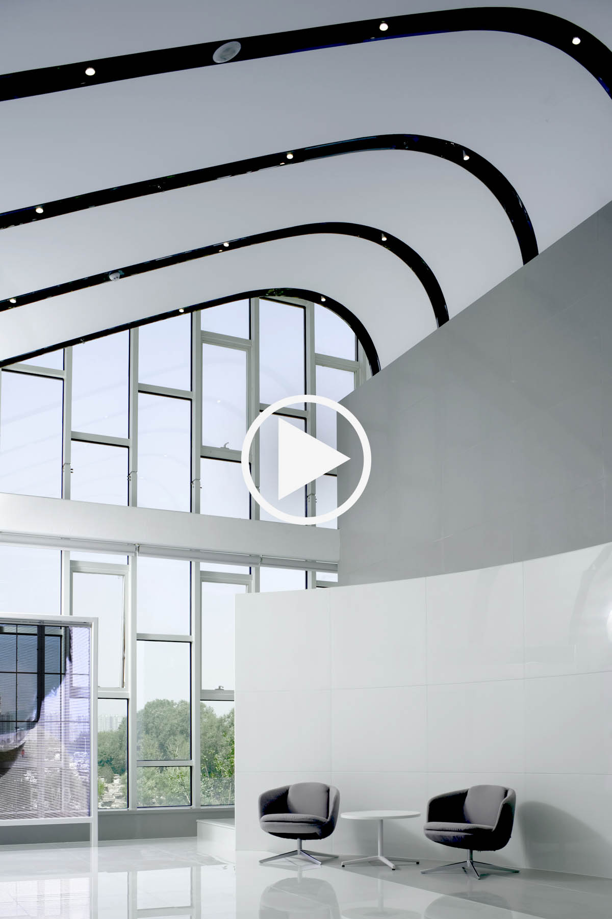
一个美好的空间其实包含着“美”和“好”两个维度。在本案主创设计师李怡明看来,创造“美”是所有设计师的追求,而实现“好”则经常被忽略。健康(包括空间物理环境的健康、身体上的健康、心理上的健康这三个递进的层次)则是“好”这个维度上最重要的指标之一。此项目为腾盛博药在北京的全球研发中心。空间设计由设计师李怡明主持设计,在其项目背景与企业文化精神之下,以‘上善若水’作为设计基调,打造平等、健康、开放且具突破与创新性的办公空间,也用以传递出腾盛博药致力于服务患者需求,提升中国公共医疗保健水平的公司使命。健康的第一个层面(健康的物理空间)必不可缺的三元素是象征生命的自然光线,清新湿润的空气、纯净清澈的水。阶梯状的休憩区域,李怡明将其命名为“海纳百川”,作为办公空间中的灰空间,既可工作、又可以休憩交流。本项目运用美国的WELL标准,结合中国市场的实际情况,采用了光感应窗帘、通电调光玻璃、总体照明与个人独立工位照明相结合的照明系统,并通过格栅天花来散射天窗的直射光,最大限度的利用了自然光线,营造出一个弥漫着温暖舒适自然光线的办公空间。空间整体颜色柔和纯净,局部点缀了企业的主题色,并贯穿始终。除此之外,根据不同的使用位置,采用多种不同质感的材质进行搭配,丰富视觉层次。为保证空间的通透性,大量运用了通电玻璃和纤维织物,使得空间更加明亮、通透与柔和,并且采用漫反射光源,避免了直射光线。以纤维织物空气分布系统(索斯风道)为主的空调系统,融合了新风过滤、静电除尘防霾、光触媒杀菌、除甲醛VOC、恒温恒湿终端等各项空气处理设备设施,再配置独立的打印室排风设备,营造出最健康的室内空气环境。整个空间没有边界,没有聚焦,尽量让空间无限延展下去、室内外慢慢融合起来,给使用者一个平和的环境。而空间始终维持在正压的环境中(类似于飞机机舱),完全隔绝了室外不健康的大气环境。茶水区也都采用了直饮水机以及抗菌铜制内芯的管线、龙头等,确保用水品质。身体上的健康是本项目关注的第二个健康层面。全员可升降的办公家具、柔性材质的地面、阳光明媚的健身房,让各种办公室综合症迎刃而解。心理上的健康是本项目中设计师最为关注的层面。全员开放式的办公场所,对所有的员工都一视同仁。私密隔声的电话亭,兼具电话和私密办公。整个办公区穿插众多的形态各异的会议休闲交流空间,适应现代办公所需的各种场景。母婴室、残疾人卫生间的设置更加表达出了企业对于人文的关怀。上善若水的设计理念,以自然、纯净的颜色材质为表达,点缀蓝色与暗红的企业色,活跃空间氛围之余,亦使沉默的空间氛围中充满力量。设计师在视觉上并不刻意强调任何事物和主体,而是通过空间自然的起承转合,让视觉层层递进。没有边界,没有聚焦,尽量让空间无限延展下去、室内外慢慢融合起来,给使用者一个平和的环境。设计是一种解决问题的方法。在此过程当中,需要不断理解和思考生活和工作的本质。一个有着健康的环境、充满着人文关怀、有温度、有情感的设计作品,是在社会形态的不断变化下,创造出的符合价值观的空间,这也是设计师对用户最温柔而坚定的回应。 Yiming Li: A ultimate practice of healthy Spaces--- Brii Biosciences' global R&D centerWhat is a fine architectural space? A fine architectural space must be evaluated from two different aspects: visual perception and user experience. Expending more effort to create a good visual perception is the pursuit of most designers. As a result, good user experiences are often ignored.” Considered by LI Yiming, the chief designer of this project. Health ( of three progressive levels including environmental health, physical wellness, and mental well-being) is one of the most important indexes to evaluate whether space has a good using experience. Brii Biosciences' global R&D center project is located in Beijing. The brief called for a new visual identity for the company’s workspaces, drawn from both their own background in medical and health care, as well as the corporate social responsibility. To this end, the chief designer of this project, LI Yiming takes “Shang Shan Ruo Shui.” (From Lao Zi, Tao Te Ching, which means the highest level of good deeds are like water which favors all without caring about vanity.) as the core design concept to convey the core mission of Brii Biosciences: “We are committed to serving the needs of patients and improving the level of public health care in China.” Based on this design concept the new office is built into an equal, healthy, open and innovative workspace. Environmental Health The first level of health is environmental health. There are three essential elements at the first level: the natural light that symbolizes life, the fresh and moist air, and the pure and clear water. The auditorium area, named ‘Hai Na Bai Chuan’ (All rivers run into the sea), is an interior grey zone which doubles as an ‘all-hands space’ for both work and leisure. The US WELL standard was adopted in the whole design process of this project and the characteristics of the Chinese market has been fully considered. In order to create an office space filled with warm and comfortable natural light, the overall lighting system combines various illuminating systems such as light-sensitive curtains, electrified dimming glass, general lighting, and individual workstation lighting. Natural light flows into each workspace through the grille ceiling which maximize the use of natural light to create a comfortable and bright work space. The theme color of the enterprise and the materials with various textures ensure the overall soft and the pure tone of the space as well as enrich the visual level. Electrified glass, fiber fabric and diffuse reflection light source are widely used to provide kind of bright, transparent and soft architectural feeling. Air conditioning system is based on a fiber fabric air distribution system. This system integrates various air treatment equipment and facilities such as fresh air filtration, electrostatic dust removal, and haze prevention, photocatalyst sterilization, formaldehyde removal VOC, constant temperature and humidity terminal, etc. The printing room is equipped with independent exhaust equipment. The healthiest indoor air environment is owed to the comprehensive ventilation and air-conditioning system of this project. The whole space has no boundary, no focus and is infinitely extended which provides the users with a peaceful and relaxing architectural experience. Space is always in a positive pressure environment (similar to an airplane cabin), completely isolated from the outdoor unhealthy atmosphere. The straight water dispensers, anti-bacterial copper pipes, and taps are also used in the tea area to ensure water quality. Physical Wellness The intermediate level of health is physical wellness. The office furniture that can rise and fall, the ground with flexible material, the gym with bright sunshine have largely alleviated the office syndrome. Mental Well-being The third level of health is Mental Well-being, which is mostly considered by the designer. The whole Office is a single space with flexible and comfortable desks in order to create free and equal working atmospheres. There are several soundproof phone booths randomly distributed in the open space which also can be used as private working units. There are a number of different forms of closed units interspersed in the open office area which provide meeting and communicating area. This design meets fast all the needs of the modern workspace. Maternal and child rooms and toilets for the disabled illustrate the enterprise's care for humanity. The designer uses natural and pure colors to interpret the design concept: “Shang Shan Ruo Shui”. The whole space has no boundary, no focus and is infinitely extended and provides the users with a peaceful and relaxing environmental experience. On the date of completion acceptance, key air indexes such as pm2.5/pm10 and VOC was close to zero
Diamond Center Restaurant
钻石中心餐厅
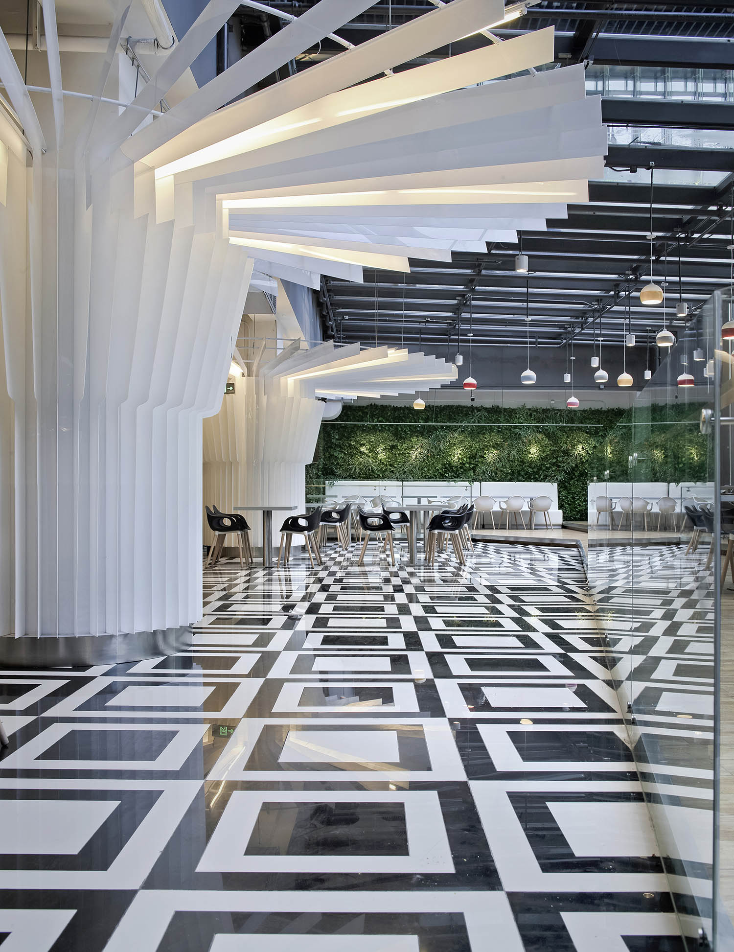
本项目是一个超低造价要求的员工餐厅,餐厅位于地下二层,其中的一部分空间通过采光玻璃天棚和玻璃幕墙得到自然的采光与通风。我们的任务是尽可能的利用现有的各种条件去降低造价,并达到最优的效果。具体的策略是从现有的柱子入手,以伞的剖面为元素,采用白色的亚克力片包围柱子,形成伞的形态。并且对于每个柱子,我们把它装饰成了略微不同的各种伞的形状。这些伞的形状从采光玻璃天棚区域一直延伸到内部,意图为内部的黑暗空间带来室外阳光的氛围。地面选用了最容易清洁并廉价的玻化砖,用了模数化的黑白图案棋盘式的拼花,在完全没有浪费任何材料的同时,给空间带来了强烈的动感以及现代艺术、时尚的气息。在采光天棚上,我们加入了一些多彩的小吊灯,宛如雨滴。整个空间就像是一幕在雨中翩翩起舞的场景,在;伞下以及雨中就餐的的空间氛围显得非常的有趣。采光玻璃上设计有流动的水幕,夏天反射日光,并利用水的温度给室内降温,冬天关闭水幕,引入阳光,形成温室效应,保证了室内温度。靠近采光玻璃天棚以及侧窗的地方,我们加入了仿真绿植墙。阳光、绿植、水、等自然的元素,为整个地下员工餐厅带来了无限的生机与活力。 As required by the owner, the project is a low cost renovation project. It is a canteen at B2 floor, with part of the ceiling in glass and curtain wall in glass for natural lighting and ventilation. Our task is to maximally utilize the existing conditions to achieve the optical effects.White acrylic plates with the same shape are applied to decorate the columns to be umbrella shapes. Each column is designed into slightly different umbrella shapes. The “umbrellas” extend from the ceiling in glass to the interior to introduce the outdoor sunshine into the interior dark space. Parquet floor tile in white and black is utilized by modular design to avoid any waste. Besides, the parquet floor tiles are cost effective and easy to maintenance. The space is irritated with intensive motions. Modern and fashionable arts atmosphere are created as well. The ceiling is additionally decorated by little droplights while reserving the original ceiling lights. The general space is like dancing in the rain. To dine under the “umbrellas” and in the rain, the images arising from the atmosphere are quite interesting.Part of the roof is in the hollow low-e glass with water curtains. In summer, the glass will reflect the sunshine and reduce the temperature through water inside. In winter, the water curtains could be closed and sunshine could be introduced into the room to form greenhouse effects to maintain the interior temperature. The interior walls close to the glass curtain and side windows are decorated by green plants. The floor close to plant walls and windows is designed to use wood-like tiles with longer durability for easier maintenance. The natural elements including sunshine, green plants and water make the B2 canteen energetic and dynamic.

Diamond Center Lobby
钻石中心大堂
中国最著名的黄山上有一颗标志性的松树,其一侧枝桠伸出,如人伸出一只臂膀欢迎远道而来的客人,这颗松树叫做迎客松。本项目是一个5A级办公楼的大堂,中心有4个柱子以及连接的梁,我们把这些柱子及梁想象成为迎客松,并寓意这是一个盛装迎接所有办公人员的大堂空间。松树表面材料采用了镜面不锈钢,以雕塑品的形态,为整个大堂植入了现代艺术的氛围。地面采用了来源于意大利的超大尺寸、且具有传统中国山水画纹理的玻化砖。整个空间用西方的现代雕塑与材料艺术呈现出独特的中国文化艺术感。前台区的背景墙采用了整面的钛合金穿孔板,一直延伸到天花,与之成为一体。天花采用水滴形的发光膜作为照明,寓意穿透枝叶的阳光。四个角落的休息座椅也设计成了树状的雕塑,既满足了休息的功能,也起到了限定空间的作用。天花及墙面采用穿孔的金属材料,能够起到吸音的作用,避免大堂产生回声。同时,玻化砖地面还可以免去了传统大理石地面的日常维护保养费用。由于大堂空间较高,地面以下还设计了热辐射的采暖系统,在保证冬天大堂里人体有着舒适的温度的同时,使能源支出最小化。 Mount Huangshan is the most famous mountain in China. It stretches hundreds of miles, with lots of pines upon the hills. The shapes of the pines look like persons who are welcoming the guests from afar. One of the pines is widely known and named as “welcome-pine”. As the lobby of a 5A grade office building, this project design is inspired by the welcome-pine. Four pillars and connected beams are decorated to the shape of the welcome-pine and symbolize the space welcome all the visiting guests and working staff. Mirror stainless steel is adopted to decorate the “welcome-pine”. The sculptures images of the pines create modern art atmosphere into the lobby as well. The floor is designed in vitrified tiles imported from Italy with Traditional Chinese Ink Painting Impressions. The whole space combines modern western sculptures and materials art to reflect traditional Chinese culture. Titanium alloy perforation panels are adopted for the decoration of the reception background and it extends from the reception to the ceiling to harmonize with the space. Water-drop shaped illuminating membranes are designed on the ceiling for decoration and lighting. It looks like the sunshine to penetrate into the welcome-pine. The chairs in the rest area of four corners are designed to the tree-shaped sculptures for rest function.The perforated metallic panels are adopted for sound absorption and avoiding the echo in the lobby. The floor in vitrified tiles instead of marble is to reduce the costly daily maintenance for marble. Under the floor, a radiant heating system was designed to guarantee the comfortable temperature and lower the heating cost in the lobby in the winter.
Dong Sheng International incubator
东升国际孵化器
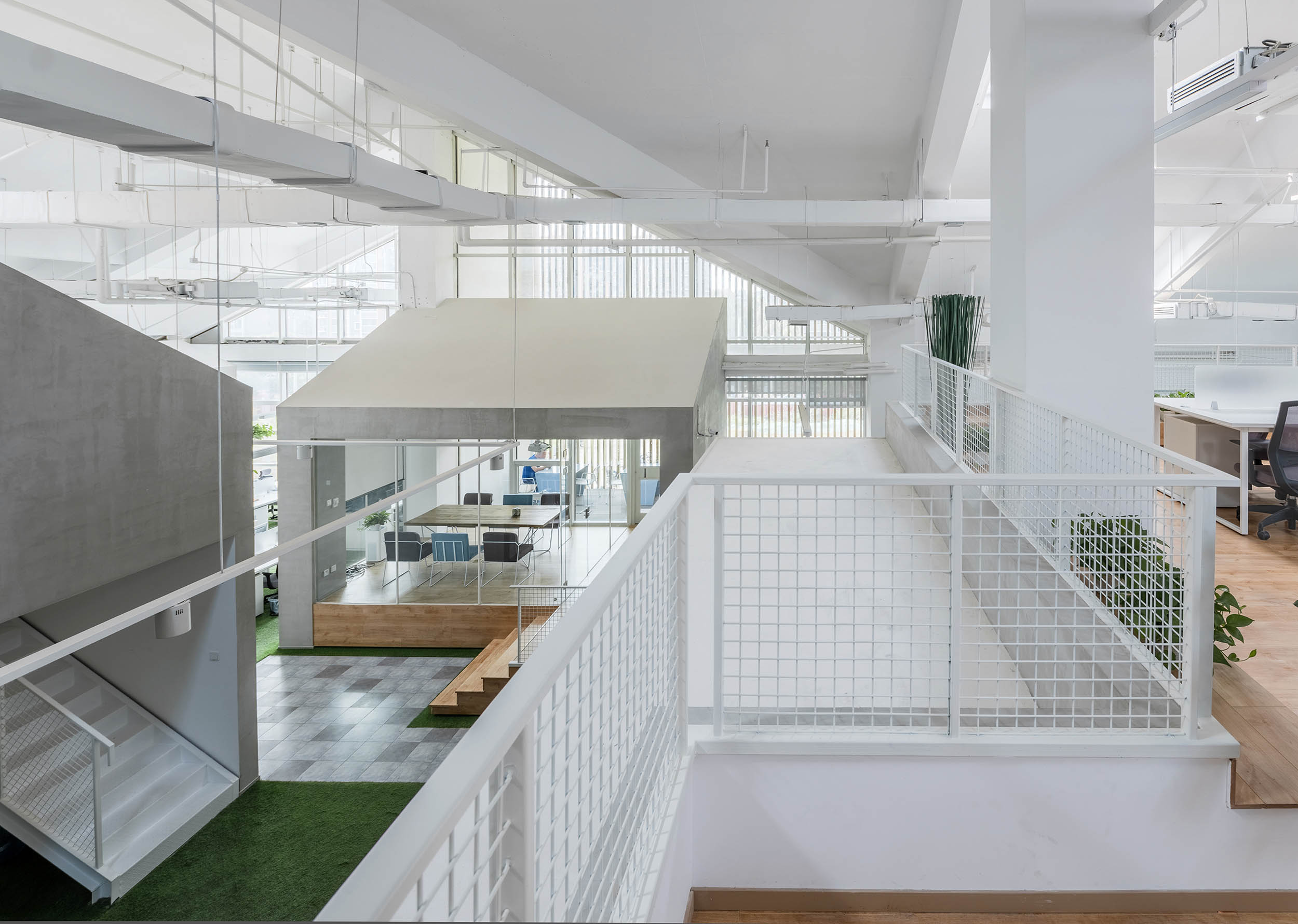
本项目位于北京一个多层、低密度、庭院式、风景优美的园区中,整个园区的建筑为现代的中式风格,项目就选址在其中一栋建筑的顶层空间,顶层空间为坡屋顶,且层高较高。设计师并没有采用常规联合办公空间中的创意、激情、个性的基调,而是以素真、自然为基调,以院落的空间主题,营造室外、自然的工作环境,希望在这里创业、工作的人们能够静心思考,回归工作、创业的本心。在边角及中心置入一些建筑,建筑间形成了院落。每个院落均以树为主体,地面采用仿真草坪地毯,院落之间采用小道串联起来,每个院落的环境都非常静雅、私密。设计师充分利用的原建筑的空间特点,在空间较高的 几个建筑里,设计了夹层,并置入连廊、楼梯将它们连接起来,丰富了空间层次。主要材料为低造价的水泥涂料、仿真草坪地毯和原木,极大的降低了建造成本。增加的夹层空间,使业主也能获得更多的营收。 The project is located in a multi-storey, low-density, courtyard-style, and beautifully landscaped park in Beijing. The entire campus is built in a modern Chinese style. The project is located in the top space of one of the buildings, and the top floor is a sloping roof. The layer height is higher.The designer does not adopt the basics of creativity, passion and personality in the conventional joint office space. Instead, he uses the theme of “the courtyard” to create an outdoor and natural working environment based on the real and natural theme. He hopes to start a business here. People who work can think quietly and return to the heart of work and entrepreneurship.In the corners and the center, some "buildings" are placed, and the buildings form a "garden. Each "garden" is dominated by trees. The ground is made of artificial turf carpets, and the "courtyards" are connected in series by small lanes. The environment is very quiet and private.Designers make full use of the spatial characteristics of the original building. In several "buildings" with high space, the mezzanine is designed and placed in corridors and stairs to connect them to enrich the space level. The main materials are low-cost cement coatings, simulated lawn carpets and logs, which greatly reduce construction costs. Increased mezzanine space allows owners to get more revenue.
Pucheng Health Hotel Serie
蒲绒健康酒店
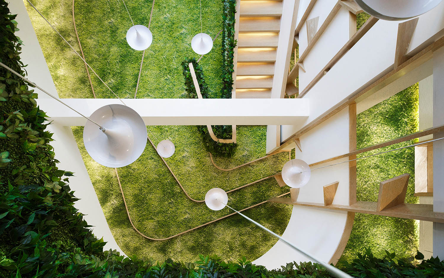
这个项目的前身是一家我们10年前设计过的由一个小商场改造而成的快捷酒店。这次业主又找到我们,想把它改造成一个高端的体检中心以及一个以健康为主题的精品酒店。由于建筑的进深很大,原有的酒店有很多黑房间。我们说服业主,自上而下去掉了3层的楼板,形成一个采光中庭。由此可以引来象征健康的阳光、新鲜的空气以及鲜活的绿植。中庭的地毯采用了定制的草坪图案。这个定制的草坪图案经过数十次的打样才最终确定,在灯光的点缀下,显得极为真实以及生机勃勃。一个侧壁挂满绿植的螺旋形楼梯从草坪地毯开始,向上延伸贯通3层中庭,寓意着生命、健康、生长。温暖舒适的光线是整个项目的核心设计要素。走廊的地面采用定制的蒲公英图案的地毯,墙面材料全部采用硅藻泥,在暖色灯带的衬托下,整个走廊都弥漫着温暖柔和的光线。硅藻泥材料所独有的分子结构也起到了营造健康生态环境的作用。客房分为欧式和中式两种风格,透过纱帘,每个房间都弥漫着温暖舒适的光线。欧式客房配备按摩浴缸,能沐浴在充足的阳光下。而中式客房则在窗边设置了舒适的双人足浴池,并在卫生间内配备有音乐桑拿房,能给客人提供全身心的健康服务及感受。健身房、瑜伽室、SPA、餐厅等房间设计在了顶层,目的是让客人在运动的同时也能欣赏北京香山的美景;天气好的时候,穿过纯净舒适的餐厅,可以在屋顶的露台休憩,或者一览四周的风景。酒店设置有防雾霾空调系统,每个房间都有直饮水。大堂有自助式体检仪,有专业人员提供诊疗结果,并定制出适合的营养套餐和运动健身计划,楼下的高端体检中心也能随时提供进一步的精确的诊疗。The predecessor of this project was an express hotel that was designed by a small mall that we designed 10 years ago. This time the owner found us again and wanted to transform it into a high-end medical examination center and a health-themed boutique hotel.Due to the depth of the building, the original hotel has many black rooms. We persuaded the owners to drop the three-story slab from the top to form a lighting atrium. This can lead to healthy sunshine, fresh air and fresh green plants.The atrium's rug features a custom lawn pattern. This custom-made lawn pattern has been finalized after dozens of proofs, and it is extremely realistic and vibrant with the lighting. A spiral staircase with green walls on the side of the lawn starts from the lawn carpet and extends up through the three-story atrium, meaning life, health and growth.The warm and comfortable "light" is the core design element of the entire project. The floor of the corridor is made of custom dandelion-patterned carpets. The wall materials are all made of diatom mud. Under the warm light strips, the corridor is filled with warm and soft light. The unique molecular structure of diatom mud material also plays a role in creating a healthy ecological environment.The rooms are divided into European and Chinese styles. Through the curtains, each room is filled with warm and comfortable light. The European-style rooms feature a jacuzzi and are bathed in plenty of sunlight. The Chinese-style rooms have a comfortable double foot bath by the window and a music sauna in the bathroom, which provides guests with a wholehearted health service and feeling.The gym, yoga room, spa, restaurant and other rooms are designed on the top floor, so that guests can enjoy the beauty of Beijing Xiangshan while exercising. When the weather is good, pass through the pure and comfortable restaurant and relax on the roof terrace. Or look around the scenery.The hotel is equipped with an anti-fog air conditioning system and each room has direct drinking water. The lobby has a self-service physical examination instrument, professional doctors provide medical results, and customize the appropriate nutrition package and exercise program. The high-end medical center downstairs can provide further accurate treatment at any time.
Terry Station Series
泰利驿站
中关村东升科技园泰利驿站是一种创新型的社会经济组织,它通过提供研究、生产、经营的场地,通讯、网络与办公等方面的共享设施,系统的培训和咨询,政策、融资、法律和市场推广等方面的支持,降低创业企业的风险和成本,提高企业成活率和成功率。泰利驿站位于园区创新中心办公楼的一层南侧。主要功能包括个人办公区,团队办公区等开敞式出租办公区域,孵化企业办公区、会议室、接待室、讨论室、图书室、路演室等相对独立的公共空间,以及为驿站提供整体服务的后勤支持团队封闭式办公区等3大区域。如何诠释出空间的内在属性、与创业者产生共鸣、使创业者迸发出更多的激情与灵感,是本案设计的核心所在。激情与灵感往往来源于对自由的向往,而对创新、对成长的呵护是驿站的使命。因此,自由呵护是对本案内在属性最好的诠释。首先,我们通过一条自由的曲线贯穿整个空间,将空间分隔成为南北两个区域,随着曲线的延展与闭合,形成各种卵形的空间,作为会议室、接待室等相对封闭的公共空间。曲线的北侧主要为个人及团队的开敞式办公区域,靠近大堂中庭,采光良好。西南侧为孵化企业办公区,相对集中、封闭。主入口的东侧为后勤支持办公区,靠近主入口,相对独立,利于对内对外服务。在入口,我们特意保留了一个高达七层的挑空空间作为玄关,没有赋予任何实质的功能,只是做了两层高的弧形半围合形态,想要传递出对创业者的呵护、成长的巨大空间与自由这个寓意。地毯的设计是本案的一大特点。从入口到整个开敞办公区,我们均采用了不同宽度、不用颜色的条形地毯进行铺装,形成一条条多彩的风景线,突破了传统的地毯铺装及色彩搭配方式,体现出创新的本质,也象征着绚烂多彩的T型舞台,祝愿每个创业者都能找到自己的成功之路。与多彩的地毯相对应, 立面与天花基本都采用纯净的白色作为主体。天花采用类似蜂巢的造型,不规则的多边形张拉膜作为照明主体,使整个空间散发着柔和的光晕,同时传达出现代与温馨之感。内凹的弧形前台与背景墙,给人们带来了明确的路线指引,在弧形的墙面上再配以弧形的洞口,形成一条条自由的双曲线,表达出自由、热情、梦幻、科技。开敞办公区域的天花采用蜂窝六边形元素为基础进行设计。六边形转变为不同的多边形,然后将其自由组合成不规则的多边形张拉膜吊顶,使人们充满新鲜感和探索欲望,并激发人们的思维。柱子采用由深到浅的渐进颜色,最终以白色融入天花,似一颗颗粗壮的大树,全力呵护着创业者。办公家具以U形为一组,以每个柱子为中心环形布置,可以相互组合成大大小小的团队,同时,也像是每颗大树的树根,扎根在多彩的舞台上。在开敞办公区与路演室、讨论室等相对封闭的空间之间,我们精心设计一个小小的内凹区域,既保证了外部空间的连贯性,又是一个不同类型空间的转换区,实现了视觉上和心理上的平缓过渡。讨论室的座椅选用了鲜艳的颜色,并冷暖搭配,渲染出讨论时自由、对立的气氛,每个参与讨论的人也可以根据自己的喜好进行选位。而桌面及四周均为白色,在一定程度上可起到缓和气氛的调节作用。路演室为一个异形的空间,不同的场合有不同的布置方式,四周的墙面均采用白色,便于路演时的讲演。地毯选用了具有编织感的线形图案及铺装方式,椅子也打破常规,采用了大大小小的彩色圆敦,使空间更具创新与自由。天花用蝴蝶为元素,抽象出几个飞舞的蝴蝶造型,寓意着路演成功后创业者破茧成蝶、展翅高飞。开敞办公区域的中心设计了一个椭圆形的多用途空间,可以作为接待室、讨论室、会议室、休息室等功能使用。用不到顶的透明玻璃作为隔断,提示出这个空间的公共性及开放性,造型现代的彩色家具很容易与彩色地毯融为一体,更增加了空间的穿透性。2014年的巴西世界杯也给我们的设计带来了灵感。足球网作为隔断的一种材料及形式,也被我们运用到了不同区域的分隔中。这样既能使空间充满运动的气息,又不乏柔和的可触摸感。相信在世界杯期间,创业者会在这感受到更多的激情。本案与大堂公共区域之间采用透明玻璃隔断,多彩的自由空间通过明亮柔和的灯光传递到大堂中庭,宣讲着自由与创新的每一个动人故事。 Zhongguancun Dongsheng Science and Technology Park·Telly Station is an innovative social and economic organization that provides research, production and operation of venues, communication, network and office sharing facilities, systematic training and consulting, policy, financing, and law. Support with marketing and other aspects to reduce the risks and costs of startups and increase the survival rate and success rate of enterprises.Taili Station is located on the south side of the first floor of the office building of the Innovation Center of the park. The main functions include open office areas such as personal office areas, team office areas, relatively independent public spaces such as office areas, conference rooms, reception rooms, discussion rooms, library rooms, and roadshow rooms, as well as overall services for the station. The logistics support team has 3 areas including closed office area. How to interpret the intrinsic attributes of space, resonate with entrepreneurs, and enable entrepreneurs to express more passion and inspiration is the core of the design of this case. Passion and inspiration often come from the yearning for freedom, and the protection of innovation and growth is the mission of the station. Therefore, "freedom" and "care" are the best interpretations of the inherent attributes of the case.First of all, we use a free curve to penetrate the whole space, and divide the space into two regions, north and south. With the extension and closure of the curve, various oval spaces are formed, which are relatively closed public spaces such as conference rooms and reception rooms. The north side of the curve is mainly an open office area for individuals and teams, close to the lobby atrium, with good daylight. The southwest side is the office area of the incubator, which is relatively concentrated and closed. The east side of the main entrance is the logistics support office area, close to the main entrance, relatively independent, which is conducive to internal and external services. At the entrance, we deliberately reserved a space of up to seven layers as a porch. It did not give any substantial function. It only made a two-layered curved semi-enclosed form, and wanted to convey the care and growth of the entrepreneur. The great space and the meaning of freedom. The design of the carpet is a major feature of the case. From the entrance to the entire open office area, we have paved with strips of different widths and colors, forming a colorful landscape, breaking through the traditional carpet paving and color matching, reflecting the essence of innovation. It also symbolizes the gorgeous T-stage, and I hope that every entrepreneur can find his own path to success.Corresponding to the colorful carpet, the facade and the ceiling are basically made of pure white. The ceiling uses a similar "honeycomb" shape, and the irregular polygonal tension film acts as the main body of the illumination, which makes the whole space emit a soft halo, while conveying the sense of modernity and warmth. The concave curved front and the background wall give people a clear route guide, and the curved wall is complemented by curved holes to form a free hyperbola, expressing freedom, enthusiasm and dreams. Technology. Ceilings in open office areas are designed based on honeycomb hexagonal elements. The hexagons are transformed into different polygons, and then they are freely combined into an irregular polygonal tensioned film ceiling, which makes people full of freshness and desire to explore, and stimulate people's thinking. The pillars adopt a progressive color from deep to shallow, and finally blend white with small flowers, like a large tree, to protect the entrepreneurs. The office furniture is set in a U shape and is arranged in a circular shape around each column. It can be combined into a large and small team. At the same time, it is like the root of each big tree, rooted in a colorful stage. Between the open office area and the relatively closed space such as the roadshow room and the discussion room, we carefully design a small concave area, which not only ensures the continuity of the external space, but also transforms a different type of space. A visually and psychologically smooth transition. The seats in the discussion room are made of bright colors, and they are matched with warm and cold atmospheres. Each person involved in the discussion can also choose according to their own preferences. The tabletop and the surrounding area are all white, which can play a role in easing the atmosphere to a certain extent. The roadshow room is a special-shaped space. Different occasions have different layouts. The surrounding walls are all white, which is convenient for lectures during roadshows. The carpets are lined with a woven pattern and paved. The chairs are also unconventional. The large and small colored rounds are used to make the space more innovative and free. Smallpox uses the "butterfly" as an element to abstract a few flying butterfly shapes, which means that after the success of the road show, the entrepreneurs break into the butterfly and fly high. The center of the open office area is designed with an oval multi-purpose space that can be used as a reception room, discussion room, conference room, lounge and more. The use of transparent glass that does not have a top as a partition suggests the commonality and openness of this space. The modern color furniture is easy to integrate with the colored carpet, which increases the penetration of the space. The 2014 World Cup in Brazil also inspired our design. As a material and form of partition, the football net has also been applied to the separation of different regions. This will not only make the space full of sports, but also a soft touch. I believe that during the World Cup, entrepreneurs will feel more passion here. The case is separated from the public area of the lobby by a transparent glass partition. The colorful free space is transmitted to the lobby atrium through bright and soft lighting, preaching every moving story of freedom and innovation.

Dongsheng Kelley Hotel
东升凯莱酒店
北京东升凯莱酒店位于中关村东升科技园内,由原有两栋相距50多米的职工宿舍楼改扩建而成。本项目的建筑、景观和室内设计均由园区的总体设计单位------北京清石建筑设计咨询有限公司担纲。酒店以紫气东来这个典故为设计引言,一方面契合了东升凯莱酒店的名称,另一方面也藉此着力挖掘这个典故所蕴含的哲思意境,并与京城文化相结合,打造别具一格、难以忘怀的酒店环境。通过极富创新的平立面改造、加建设计,建筑、室内、景观完美的结合,相互为景,在极其有限的空间内展现了丰富的视觉层次,并且与园区内相邻的其他建筑相得益彰。贯穿于室内外的老北京主题鱼盆、水景,新旧建筑内匠心独具的差异化、高科技客房空间,位于屋顶的观景室内泳池,健身房,精心营造的阁楼spa空间以及茶室,无一不给客人带来惊喜及完美的体验。Beijing Dongshen Gloria Plaza Hotel, located in Zhongguancun Dongshen Science & Technology Industrial Zone, was renovated and expanded from two staff buildings with distance more than 50 meters. The architecture, interior and landscape of the project was taken by Beijing Qingshi Architecture Design and Consultancy Co., Ltd.. The hotel design was inspired by the Chinese allusion “the purple air comes from the east - a propitious omen appears”. It coincided with the hotel name and reflected the philosophical image of Chinese culture—especially Peking culture. An extraordinary and impressive hotel atmosphere was created. Through innovative flat façade renovation, creative expansion design, the architecture, interior and landscape are perfectly combined and interaction design indicates alluring visual impact also with the adjacent buildings. Stepping into the lobby and suite of the hotel, Peking culture shadows with waterscape and fish basins, the mixture of traditional buildings and modern buildings contrast, high-tech luxurious suite, roof swimming pool and gym, attic SPA and tea house, you feel infinite surprise and perfect experience.
Vanke BOYU Series
万科泊寓系列
泊寓 ,是万科为在都市拼搏奋斗的青年人打造一款既有城市的精彩又有家的温度的长租公寓产品。清石设计作为泊寓品牌的战略合作伙伴,提供有调性的空间设计方案,以及高性价比、高出房率、适应性广、模块化批量采购、快速复制、省心的全案服务。产品从安全、舒适、便利、服务、社群活力等维度全方位的为青年人提供一站式的租住体验,让青年人的城市生活更加精彩。产品试图从外到内,从城市文化链接、舒适体验、贴心服务、情感共鸣等多层面让城市与泊寓这个城市青年之家联系更加紧密,内容更加丰富多彩。 泊寓通过联网安防、十七件套、舒适卫浴、极速WiFI、恋爱厨房、活力客厅、V盟生活等产品模块的打造,让都市青年人的生活更有归属感,更能感觉到家的温馨和舒心。泊寓是万科对青年人都市生活构想的一种城市理想,一种全新的生活方式,要让青年人的居住需求在家的温度和城市的精彩之间得到满足和释放。Bo Yu is Vanke's long-rental apartment products for the young people who struggle in the city to create a wonderful and family-friendly temperature. As a strategic partner of the Po Yu brand, Qingshi Design provides a tonal space design solution, as well as cost-effective, high room rate, wide adaptability, modular bulk purchase, fast copy, and worry-free full-service. The products provide a one-stop rental experience for young people from the perspectives of safety, comfort, convenience, service, and community vitality, so that the urban life of young people is more exciting. Products from the outside to the inside, from the city's cultural links, comfort experience, caring service, emotional resonance and other multi-faceted aspects, the city and the park of the city's youth home more closely connected, the content is more colorful. Through the network security, seventeen sets, comfortable bathroom, speed WiFI, love kitchen, vitality living room, V-Meng life and other product modules, the hotel will make the life of urban young people more sense of belonging, and feel the warmth of home. Comfortable. The parking space is Vanke's urban ideal for the urban life of young people. A new way of life is to satisfy and release the youth's living needs between the temperature at home and the city's wonderful.
Zhongguancun Manufacturing Street Reconstruction
中关村智造大街改造
本项目中清石设计为业主提供了全案设计服务,全面配合业主运营管理周期,分阶段提供设计服务,可持续定制化的设计服务使业主得到充分的技术支持。与业主一起将东升科技园区打造成为汇集总部基地、高科技产业研发基地、加速器及企业孵化基地、高科技成果及相关配套服务为一体的国内一流生态型综合园区。设计改造完成至今,东升科技园区已成为目前中国单平米产值最高的科技园区之一。 In this project, Qingshi Design provides the owner with the whole case design service, fully cooperates with the owner's operation and management cycle, provides design services in stages, and the sustainable customized design service enables the owners to receive full technical support. Together with the owners, Dongsheng Science and Technology Park will become a domestic first-class ecological comprehensive park integrating the headquarters base, high-tech industry research and development base, accelerator and enterprise incubation base, high-tech achievements and related supporting services. Since the completion of the design and renovation, Dongsheng Science and Technology Park has become one of the highest-tech parks in China.

LIGONG Chinese Restaurant Beijing Poly Plaza
保利大厦丽宫餐厅
丽宫餐厅位于北京二环坐标保利大厦二层,是保利大厦(酒店)的配套中餐厅。保利大厦拥有292套四星级标准客房、豪华套房、以及可容纳1320座位的著名的保利国际剧院。保利大厦的特色餐饮名遍京城,其中最为有名的就是丽宫餐厅。本案是对老丽宫餐厅环境的整体改造提升。设计通过提炼江南中式花窗和竹子符号做为空间主题元素,营造 透、露、藏、雅的空间意境;摈弃对风格样式的表象追求,极简示人,凝结中式朴素无华的本质,契合中式含蓄内秀的设计精髓;打造出简约静怡的新中式就餐环境。

Beijing Poly Plaza Lobby Bar Renovation
北京保利大廈大堂吧改造
北京保利大厦大堂吧改造:地标性建筑的微更新01项目背景跨越30年的北京地标建筑「微」更新项目坐落于老保利大厦首层大堂(保利剧院的入口)。老保利大厦作为上世纪90年代北京城的地标建筑,已经经历了30年沧桑岁月,见证了北京城的发展变革,而保利剧院(北京保利国际剧院)是镶嵌在京城文化市场的一颗明珠,是首都重要的演出场所之一。不少享誉盛名的国内外艺术团体都在此登台献艺,是举行大型演出的会议活动的场所。02改造需求「旧」空间无法匹配多样化的使用场景基于这样的项目背景,业主对项目的空间设计需求就是要有保利剧院的文化艺术内涵,在功能上要满足剧院和大厦休闲等候接待的功能,同时要有一定的私密性,因为经常会有一些名人在此处等候演出及观演。03改造策略兼顾速度与实用本项目要在保证时间及不影响大厦和剧院的正常营业的前提下,通过急速改造的手法,满足对空间功能和风格提升的同时不对剧场和大厦的使用产生影响。大堂吧的新平面设计是基于原有大堂吧布局的基础上进行升级改造。首先大堂吧的位置位于入口旋转门右侧,紧挨大厦入口和保利剧院的入口,人流量大,私密性差。为了增加大堂吧的私密性,同时又不能将大堂吧与保利大堂及剧院完全分离开,因此在平面上既要有独享的空间又要跟整个大堂的氛围融合,我们的空间布局遵循“通而不透、隔而不漏”的设计原则,用现代质感的金属屏风围合大堂吧的区域,与大堂形成视觉和心理上的隔断。在内部的空间布局中,讲究家具布局组合的层次和实用性,将风景最好的区域设计为私密交谈的尊享沙发卡座交流区。04灵感的诞生中西文化的融合演绎---静、雅、色空间的整体风格和灵感来源于对保利大厦和保利剧院历史文化的深层次的理解。进入保利大厦首层大堂首先看见的是矗立在剧院门口的《秦公簋》的铭文,设计中结合大堂的现状和保留剧院的国际化定位,因此空间风格为新中式与西方现代风格混搭的风格。既有中式文化的金属屏风和山水地毯又有北欧现代家具穿插在空间中。设计师希望以空间极速升级改造的手法实践地标性建筑的微更新,在最大程度上不影响原空间使用的前提下,通过建筑内局部功能空间的极速升级改造为老建筑营造新的空间氛围,让老建筑有了新生机。

Dongsheng Science Park Party and Mass Activity Center
东升科技园党群活动中心
阿里云助力打造「多功能」党建展厅党的十九大召开以来,全国各地都展开党群展厅建设。清石设计为东升科技园设计的全新党群活动服务中心希望在功能上进行多样化的扩展,不仅仅满足党群展厅的基本要求:园区党建文化、党建成果进度、党建荣誉的展示平台,更加能够成为举办园区各种活动的活动中心。真正从功能上将文化展示与园区活动进行深度融合,创造更好的传递党政精神的场所。01 | 一颗种子的生长党群活动服务中心的整体设计灵感来源于毛主席对共产党人的一段表述:“我们共产党人好比种子,人民好比土地。我们到了一个地方,就要同那里的人民结合起来,在人民中间生根、开花。”我们提取“种子”这个关键词,如果党政精神是一粒种子,在当代城市环境下,设计师的职责就是为这粒种子创造生根发芽蓬勃生长的「空间」。02 | 一个空间,多种场景以“种子”概念为出发点,整个展厅布局以中心的活动模块为核心,四周围绕的环形展示空间形成了的顺时针观展流线。位于展厅中心的活动功能区设计为灵活的半包围结构空间,四片灵活移动的隔断墙可以根据不同的使用需求调整空间的形态和大小,配合可移动桌椅的设计可以衍生出三种不同场景的使用模式,分别是:容纳20—30人的党课模式、容纳40—50人的发布会报告厅模式、容纳80—100人的会议活动模式。03 | 党建展厅的新风格不同于传统党建展厅,空间整体风格现代简约,契合东升科技园的科技感,空间整体背景色选用白色,传统的党建展厅的红色为配色。围绕展厅外环的不规则弧线形红色地铺,作为室内设计与展厅导视系统结合的一种方式起到了引导参观流线的作用,同时整体红色地铺组与白色地面拓扑形成了一个类似四叶草的形状,预示着党政精神是一粒种子在展厅中生根发芽,蓬勃生长。04 | 阿里云科技助力,推动沉浸式体验展厅的外环展陈部分一共设置了四个板块,分别为序厅、东升模式、智慧党建、企业风采。大量科技多媒体展陈方式的植入,使参观过程拥有更好的互动体验,也让党建精神和党建成果能够更加直观可视化呈现。序厅映入眼帘的是党旗造型的巨大形象墙,“以奋斗者为本,为创业者服务”红色立体字的slogan凸显东升精神。东升模式版块展墙和发光天花一体化设计配合地铺,让整体空间仿佛一条能够跨越时间的隧道,一路走来,配合滑轨电视的多媒体展陈方式,东升辉煌的发展历程得以完整的呈现。时光隧道的结尾是以互动投影方式呈现的东升模式。智慧党建版块仅有一块巨大的展示屏的智慧党建版块简约而不简单,阿里云智慧大数据助力让整个东升园区的党建工作可视化展示成为可能,党建成效更加可听、可触、可感。企业风采展示版块设置了多媒体展示、展板展示以及活动展台等多样化的展示手段,全面展示企业的经营成果。

Ziroom MEETA
自如MEETA
自如寓为北京自如资产管理有限公司旗下O2O公寓产品,是一家致力于为住户创造品质租住生活,与最佳的租住体验的互联网公司。2014年8月,在互联网大会上自如熊林提出“不是租客,是自如客”。在自如寓Ziroom MEETA的设计中,设计风格以现代时尚、简洁明快为主格调,装饰配套突出舒适温馨,让小小的空间也有灵动性,为住户在繁忙都市中打造一处避风港。寓中公共空间可以分为基础设施公共空间和系统公共空间,基础公共空间主要包括厨房、餐厅、洗衣晾晒房、宠物盥洗室。系统公共空间包括群体聚会、娱乐的场所,如屋顶花园、屋顶酒吧桌球区、健身房、休闲区、书吧。设计师更是让大厅的大部分处在挑高空结构之下,大面积的玻璃窗带来了良好的采光,以保证无论日夜均有柔和的光影流动。
Time space business incubator
乘时空间创业孵化器
乘时空间创业孵化器位于中关村智诚科创大厦,是由INNO.ECOS、中关村东升科技园指导,北京东晟合创科技孵化器有限公司运营的众创空间。 打破项目前身曾是一个商业空间,原室内空间本身适应商业业态的大体量,给人带来巨大的空旷和不安全感。如何打破商业空间的巨大体量,适应业主希望的联合办公空间,是本项目的第一步。设计师为满足联合办公对空间本身适应性、实用性以及功能性的要求,同时兼顾清石对“疗愈系”办公空间的实践探索。清石设计团队延续 “空间新陈代谢”的核心设计理念,通过设计让空间功能更新,为老空间带来新的活力,同时也完成了空间业态的完美转型。 重塑平面布局的设计过程中充分考虑了空间尺度带给使用者的心里感受,为使用者提供有安全感和私密性的共享办公空间。设计师将共享休闲交流区,包括随处可站可卧的休闲区以及其它正式与非正式洽谈区和会议空间等,有节奏的穿插在办公单元之间。这些公共空间将各个开敞、独立办公区有机的结合在一起,为整个空间带来活力。花园为创造健康的、能够自由呼吸的空间氛围,设计师以“几何花园”为主题,将自然界绿色、蓝色、木色引入空间,再进行延伸、转化、重构,最终在空间内形成一个自然、舒适、放松的一个办公环境。空间中,绿色的轻快,活力与蓝色的睿智,在空间中相互配合又相互“制衡”,搭配温暖的木质纹理,营造着温馨而活泼的工作氛围。空间中随处可见的绿植,以自然的生机为空间注入生命力。整个空间通过建筑构造、色彩、线条、材质为使用者打造了一个城市中的花园,大概没有比在花园中办公更加治愈的事情了。新生乘时空间创业孵化器是一处集接待、洽谈、头脑风暴、共享咖啡、会议、路演于一身的全新多元功能体,是一处能够在花园中办公的城市“乌托邦”, 是需求与空间模式的动态平衡,也是实现“新陈代谢”核心设计理念下的一次对“疗愈系”办公空间的实践与探索。
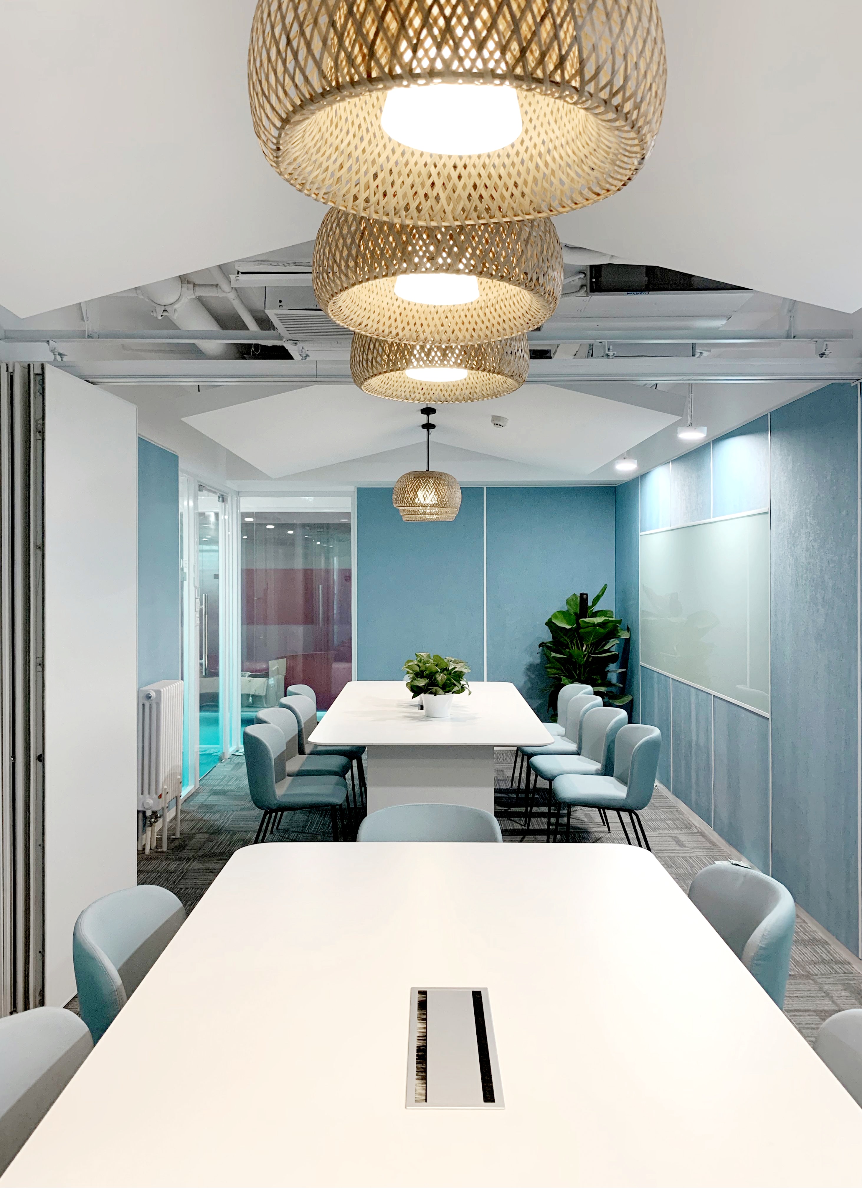
Dazhou Tongchuan (Beijing) Innovation Center
达州·通川(北京)创新中心办公空间
达州·通川(北京)创新中心办公空间设计项目,设计师希望打造一种“疗愈系”科技氛围办公空间。为突出空间的科技感,契合企业科技创新的经营理念,整个办公空间以科技蓝色为主色,同时为了避免大面积冷色给人的冷峻疏离的心理感受,抚慰疫情为人们心理带来的不安全感,设计师在空间中穿插点缀了温暖有力量的中国红点缀,用来调和冷色调,对比色打造具有疗愈感的温暖科技空间。 整体空间在材料使用上较为克制,每一种材料背后都希望指向一种独特的空间关系和与之对应的美学构筑。顶面使用白色涂料,在层高有限的条件下局部吊顶,最大程度上消解了办公楼净高有限给人心理带来的潜在压力。公共区域增加金属和木质材质使整体空间更加富有层次,增加休息区空间的有效亲和力。 基于办公空间需要的多形态及场景组合,独处与讨论,安静与喧闹,坚硬与柔软,设计师希望在矛盾中寻求统一。独立办公空间、开场办公空间、公共区域、休闲区域、展示会议等功能以一种克制的姿态穿插,为运营和管理提供了空间角度最高效的支撑。设计师想要在一种更简约的秩序中,寻找多样的层次,使物质与感官彼此呼应产生共鸣。通过不同材料、色彩和功能的组合,衔接、塑造整体空间,运用材料质感与构建工艺描述物质与意识之间的张力平衡。 为探索后疫情时代“疗愈系”科技的办公空间,我们聚焦空间与使用者心理之间的潜在关联,并试图寻找暗藏其中的设计逻辑。 我们认为设计师的职责之一是对成本和效能的最大化平衡,解决甲方的实际问题,同时兼顾时代对设计的诉求,以极低的成本帮助办公体现品牌商业价值,同时提升空间使用率,避免追求浮夸的极端形式,为了设计而设计。
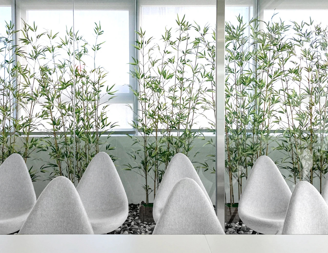
Amy Space Technology Incubator
埃米空间科技孵化器
埃米空间科技孵化器采用“产业垂直+深度孵化”模式,深入挖掘和培育科研机构新材料领域成熟科技成果,提供技术商品化和企业化运营管理全方位解决方案,帮助早期新材料项目突破从0到1的发展瓶颈,努力打造专业化新材料领域科技成果孵化平台。清石设计一直致力于将空间新陈代谢的核心设计理念容纳到不同地域属性的项目中,创造出有机健康,文化内涵丰富的室内空间。 缘起 设计概念缘起于设计师对绍兴的印象:小小的水乡,将烟雨、水波、青葱及园林融于一身。郁郁葱葱的小径,环绕着被水波围绕的园林城市,便形成那“一迳抱幽山,居然城市间”的优美画卷。 解构 设计师希望通过将脑海中对绍兴的印象的完整画面拆解成一个一个符号化的片段,并将这些片段植入传统共享办公空间。“镜·园”的概念便源于此。它既是设计的概念主题,也是“镜·园”的视觉界面。设计师舍弃大面积繁重的装饰与装点,以办公的舒适度为设计焦点,将绍兴印象与空间相结合;“以镜代水,以地为园”,试图表达我们感受到的“一迳抱幽山”的意境。 造境 人在空间中行走的过程产生了对于空间连续的体验,设计师为了让这个过程更加生动有趣,将中国园林中的「移步异景」植入室内空间。通过镜面、软膜、植物、地毯将室内各个空间串联,以便在有限的办公空间内创造丰富的视野,从而将办公变成具有多样化场景和体验的“城市园林”。空间穿行中,不同层级的“小园林”随着视野变化再现或消失。在1320㎡的办公空间中,通过置入大小不一的“小园林”,自然而然的形成办公与办公的界限,大幅度丰富空间体验。在项目设计中,以绍兴的专属印象为概念,结合新陈代谢的设计理念,将绍兴园林融入办公;“以天为镜,以地为园”打造一个健康、有机的园林共享办公空间。
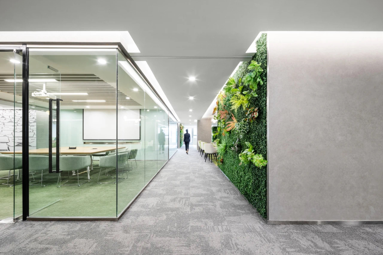
3WCoffice shared office space
3WCoffice共享办公空间
3WCoffice作为中国最完善的创业服务生态圈3W中的一环,3WCoffice一直致力于打造受年轻人喜爱的办公空间及企业服务。目前已在全国十余个城市,落地了14个创新创业社区。本项目是3WCOFFICE进驻绍兴迪荡的首个共享办公空间,位于绍兴水木湾区科学园,是一个以科创企业为服务群体的众创空间。 作为本项目的设计团队,我们希望为绍兴打造具有地域特色的3WCoffice创业空间。项目之初绍兴给我们展现的图景:阡陌交错,溪水潺潺,百屋青瓦,石板小道,人杰地灵,无需多余装饰,便是当地的独有美感。项目选址于此,我们对项目的设计宗旨始于清石设计的核心设计理念:空间的新陈代谢。我们希望以空间新陈代谢为设计核心理念进行空间地域性的延展和健康理念的植入。 -壹-归园空间新陈代谢归于地域与文脉在现代城市中,从来不缺现代主义建筑。在全球化进程之中,世界在逐渐趋同,城市变得千篇一律。建筑空间不仅仅是物理的、客观的,同时也是有机的。空间新陈代谢的核心理念之一就是赋予空间地域特性以及时间维度的文化基因传承。空间设计不仅仅是对传统、文化的一种保护,也是一种城市发展多元化的体现。 -貳-田居怎样让工作也能悠然与自得我们希望设计不从某一特定风格入手,而是基于场所与文脉,同时结合实际使用需求,将空间新陈代谢设计理念延伸为健康空间的探索与实践。室内空间设计结合功能与动线,让空间布局自然流动生长,充满逻辑同时丰富多变。整个孵化器办公空间布局围绕核心的共享区展开,将共享功能模块布置在建筑几何中心使得空间配比相对均衡。通过提取田地、阡陌、水渠等标志性的元素,建立起各个功能空间的关联性。穿行中,使用者能够体验到空间的疏密和光影变换。此外,整个办公空间内还使用了节能灯具和仿真绿植,在节约资源、生态健康化的基础上实现了功能、技术和艺术的有机结合。简单的线性灯带和地毯材料分隔出的空间,让共享空间没有强烈的区域功能感,身处于其中又不会感觉拘束,而是放松和自在,营造出一种自然与人工环境的和谐氛围。关注空间与使用者心理健康之间的关联性,希望借助设计,弥合现代办公空间与使用者体验与心理健康之间的间隙,营造更加优质健康的空间环境。
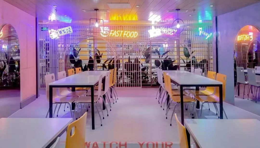
Dongsheng Technology Park C-2 Staff Restaurant
东升科技园区C-2员工餐厅
项目概况:东升科技园C-2员工餐厅位于科技园区内部,面积约为2500平方米。随着城市发展、消费升级,无论是线上还是线下都迎来了体验升级的转折点。餐厅原有环境中灯光整体偏暗,家具陈旧,功能动线划分不明。陈旧的餐厅设施和形象满足不了内部使用、对外交流和宣传的需求,不适应新时代群体的高效、秩序、活力的年轻诉求。 业主诉求:1. 全面提升整体氛围,打造年轻客户群体喜爱的有品质的餐饮空间2. 餐厅服务于整个科技园区入驻企业,因此需要在不影响客户就餐的基础上对餐厅进行改造 灵感来源:即使是天马行空的创意,也应是有迹可循。设计师将原有空间中的圆形元素定义为设计中最坚韧的根基,连接活力的色彩,串联成流淌在整个空间里的就餐情绪。一种法式甜点—炫彩马卡龙便成为形式上的借喻,彩色小圆饼,不仅仅是一种美食更承载着一种文化,一种生活方式。将趣味性、奇思异想的元素与挑战传统的形式及配色结合在一起,希望餐厅在满足就餐场景外还是大家聚会、下午茶的好去处。 改造策略:快,20天完成2500平方米改造。采用分区施工+全预制方法缩短工期,餐厅完全正常营业的情况下完成改造。好,设计师对餐厅功能、导视、环境、形象进行整体升级改造,并应用一种新的设计语言来塑造整个内部空间。全方位提升空间品质,丰富空间使用场景,以优质的空间为业主带来更多的商业价值。省,以为业主节约成本为目标,强大供应商库支撑将优价材料创新用法,保证品质的同时为业主节约成本。快 20天,2500平方米硬装改造中,餐厅原始干净利落的轮廓和格局保持不变,并且为了避免硬装的破坏对就餐环境产生影响,选择场外加工,现场安装的方式。快速改造公共空间,打造出和谐的建筑空间,平衡就餐环境的空间感受。这次餐厅改造的最大特殊之处是在不影响其营业的基础上整体进行翻新改造,从设计到施工到竣工,装配式、环保、快速等词如影随形,设计师认为空间快速升级改造能在最短时间后令场景传达出一种惬意的生活状态,让就餐人员于有形空间里感受无形美好。好 为业主节约项目成本整个空间的升级改造避免大拆大改,尽量利旧。场景中引入绿植打造可循环的绿色就餐环境。挑空就餐区新增气球灯具,空间材质考虑到时尚和施工方便采用防水磨石地胶和阳光板及一些金属构建,其他改造多采用色彩运用替换多余的造型,从成本源头替业主做到省。省 用优质空间为业主创造商业价值为了强调就餐好秩序,设计师进行了标识导视系统改造:1. 突破常规思维在顶面上贯穿灯光导引线,核心节点位置设置球灯区域标识。2. 档口位置趣味性导视设计起路线指引作用,引导顾客自觉排队。软装改造中,对现有的桌椅、沙发、墙面进行可持续化的翻新处理。空间整体借喻马卡龙,在色彩上运用低饱和度的粉色和蓝色,软装色彩以其纯粹的特征传达出“温暖舒适,积极向上,时尚艺术,活力阳光”的氛围。整个空间多处引入金属网,金属架,金属线条重新定义建筑格局与就餐人员的关系,让老旧建筑变得适合今天的生活,配合着亚克力造型植物和霓虹灯弱化由刚性的几何平面带来的疏离感,让人体验到充满亲切感的空间感受。 设计师试图用设计把开放、积极的生活态度传递给空间中的所有人,希望到这里用餐的人能体会到一种惬意的生活状态。餐厅,不仅仅是一个有形的物理空间,更是一份返璞归真,不急不躁的心灵礼物。希望在这里,你完成的是一次用餐亦是一场和自己和家人和朋友和同事甚至和陌生人的轻松对话。 Project Overview:Dongsheng Science and Technology Park C-2 employee restaurant is located inside the Science and Technology Park, with an area of about 2500 square meters. With the development of cities and the upgrading of consumption, both online and offline have ushered in a turning point in experience upgrade. In the original environment of the restaurant, the overall lighting is dim, the furniture is outdated, and the function line is unknown. The outdated restaurant facilities and image can not meet the needs of internal use, external communication and publicity, and it does not meet the needs of efficient, orderly and dynamic young people in the new era. Owners demand:1. Comprehensively enhance the overall atmosphere and create a quality dining space loved by young customer groups2. The restaurant serves the entire settled enterprises in the science and technology park, so the restaurant needs to be transformed without affecting the customer's dining Source of inspiration:Even wild ideas should be traceable. The designer defines the circular elements in the original space as the most tenacious foundation in the design, connecting the vibrant colors, and cascading into the dining mood flowing throughout the space. A type of French dessert, colorful macarons, has become a formal metaphor. Colored buns are not only a gourmet but also a culture and a way of life. Combining the fun and whimsical elements with the traditional forms and color matching challenges, I hope that the restaurant is a good place for everyone to party and afternoon tea in addition to meeting the dining scene. Transformation strategy:Quickly complete the renovation of 2500 square meters in 20 days. The zone construction + full prefabrication method is adopted to shorten the construction period, and the restaurant is completely renovated with the normal operation of the restaurant.Well, the designer upgraded the restaurant's functions, guidance, environment, and image, and applied a new design language to shape the entire interior space. Improve the quality of the space in an all-round way, enrich the use of space, and bring more commercial value to the owners with high-quality spaces.Province, with the goal of saving costs for owners, a strong supplier base supports innovative use of premium materials to ensure quality while saving costs for owners.As fast as 20 days, 2,500 square metersDuring the renovation of the hard installation, the original clean and neat outline and pattern of the restaurant remain unchanged, and in order to avoid the damage of the hard installation to affect the dining environment, the off-site processing and on-site installation are selected. Quickly transform public spaces to create harmonious architectural spaces and balance the spatial experience of dining environments. The biggest special feature of this restaurant's renovation is that it will be renovated as a whole without affecting its business. From design to construction to completion, assembly, environmental protection, and fast are words that go hand in hand. After time, the scene conveys a comfortable living state, making the dining staff feel invisible and beautiful in the tangible space.Good project cost savings for ownersThe entire space is upgraded and renovated to avoid major demolition and major changes, and to make the oldest possible. Green plants were introduced into the scene to create a recyclable green dining environment. Balloon lighting is added to the dining area. The material of the space is stylish and convenient for construction. Waterproof terrazzo flooring and solar panels and some metal are used for construction. Other transformations use color to replace excess shapes, and save the owner from the cost.Promote business value for owners with premium spaceIn order to emphasize the good order of dining, the designer carried out the transformation of the sign guide system: 1. Break through the conventional thinking and run through the light guide line on the top surface, and set the ball lamp area logo at the core node position. 2. The interesting guide design at the stall position serves as a route guide to guide customers to consciously line up. In the renovation of soft furnishings, the existing tables and chairs, sofas and walls are sustainably refurbished. The overall space is metaphorical to Macaron. Low-saturation pink and blue are used in the colors. The soft colors convey the atmosphere of "warm and comfortable, positive, fashionable art, vibrant sunshine" with its pure characteristics. Metal mesh, metal frames and metal lines were introduced at multiple places throughout the space to redefine the relationship between the architectural pattern and the dining staff, making the old building suitable for today's life. Accompanied by acrylic modeling plants and neon lights weakened by rigid geometric plane The sense of alienation makes people experience the feeling of intimacy in the space. The designer tried to use the design to convey an open and positive attitude towards life to everyone in the space, hoping that those who dine here could experience a comfortable living state. The restaurant is not only a tangible physical space, but also a spiritual gift that returns to normalcy and haste. Hopefully, what you have done here is a meal and a relaxed conversation with yourself, family, friends, colleagues and even strangers.
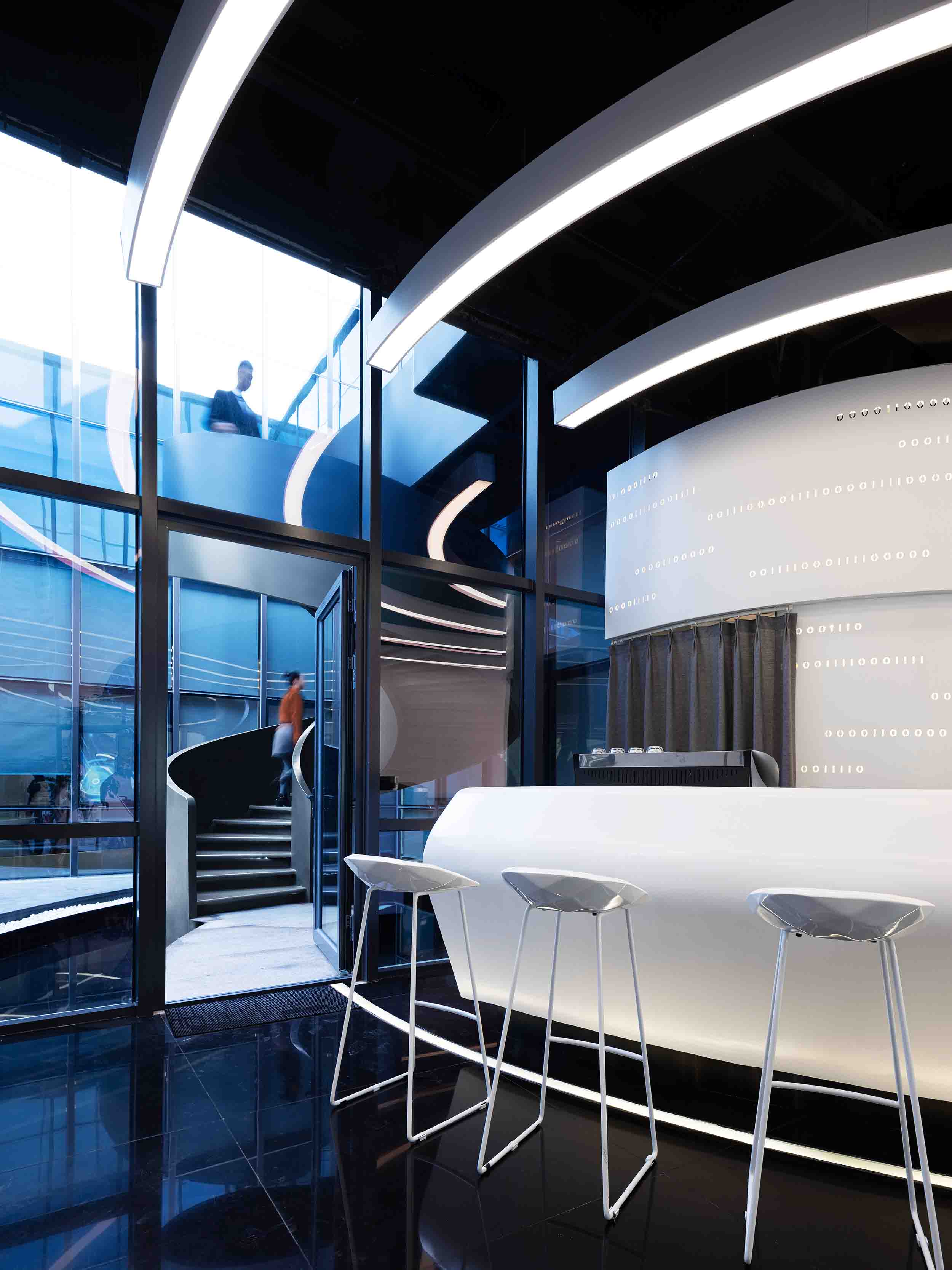
Wave at Yunshan Marketing Center
浪潮一览云山营销中心
本项目坐落于涿州市高新区,是浪潮涿州大数据产业服务基地。项目的空间立意发迹于文化力量,更连接着与未来同频的科技智慧。设计团队以科技未来感之折线作为设计元素,打造科技馆式,体验式的营销中心;以高科技为主轴,融入VR体验、3D幻影城市、全息投影、机械臂等技术和扎哈风格的场景,营造科技与未来的视听盛宴。本案的空间形态设计是如何体现浪潮大数据的科技特性呢?空间又是什么呢?空间设计师李怡明、周全贤是这样诠释的:大数据是流动的汇聚、是像云一样虚拟的运算,而空间则是视觉感观后的心灵意境。带着这样的理解,设计团队提取科技感的“二进制”元素和“行云流水”的曲线空间造型,利用光和镜面的反射营造科幻的大数据意境。项目的空间布局选择“行云流水”的曲线贯穿整个空间,富有张力的曲线将前台接待区、浪潮展示区、沙盘区、儿童区和书吧咖啡区连接起来碰撞出耐人寻味的科技未来感。游走在整个空间之中,曲线所连接的每一个功能区都是一个视觉中心点,一步一景、层层递进,巧妙的通过线与面的缓急对比强化视觉上的层次感,让客户体验到充满流动感的空间感受,完成科技感十足的沉浸式体验。营销中心的中间区域为室外中庭区域,设计师在该区域选择流畅线条的螺旋楼梯作为中庭的视觉中心。楼梯贯穿上下交汇四周,使得空间划分错落有致、自由灵活,强化建筑的纵深感,彰显科技时代的气息。地面材料以阿姆斯壮塑胶地板,水磨石和冠军黑色高亮光地砖为主。这种整体无缝连接的建筑材料选择和质感呈现,提供了更具时尚美感,科技感的共享空间,也很好的契合和表达了“大数据产业服务基地”现代新潮的氛围。顶面空间通过搭配使用裸顶喷乳胶漆,软膜天花,条形铝板灯带等材料强调出空间的动感和质感,传达刚柔并济的空间气质。墙面采用铝板穿孔打造极具科技感的面部空间,同时使用可塑性极强的GRG高强石膏完善细部处理。高效和低价的建筑价值通过设计选材也体现得淋漓尽致。浪潮一览云山营销中心自内而外保持着科技的视觉效果,为用户增添了一个具有动感和趣味的新维度体验,被评为京西最科技最美的售楼处。Located in the high-tech zone of Zhuozhou, this project is a service base for the big data industry of the Tidal Wave Zhuozhou. The spatial conception of the project originates from the Cultural Power and connects the scientific and technological wisdom with the future. The design team takes the broken line of the sense of the future of science and technology as the design element to build a science and technology museum-style and experience-style Marketing Center Vr Experience, 3d Phantom City, holographic projection, robotic arm and other technology and Zaha style scene, creating technology and the future of audio-visual Feast. How does the spatial form of this case embody the technological characteristics of the tidal wave big data? What is space? Space Designers Li Yiming, Zhou Quanxian is this interpretation: Big Data is the flow of convergence, like cloud virtual computing, and space is the visual perception after the mental mood. With this understanding, the design team extracted the technical binary element and the flowing curve space modeling, using light and mirror reflection to create a science fiction big data mood. The spatial layout of the project was chosen to follow a continuous flow of curves through the entire space The tension curves connect the reception area, the wave display area, the sand table area, the children's area and the book bar and coffee area to create an intriguing technological future. Walking through the whole space, each functional area connected by the curve is a visual center point, one scene at a time, layer by layer, subtly enhancing the visual sense of hierarchy through the contrast between the line and the surface Let the customer experience is full of the sense of flow of the space feeling, complete a sense of technology full of immersion experience. The central area of the marketing center is the outdoor Atrium area, where the designers chose the sleek spiral staircase as the visual center of the Atrium. The stairs run through the intersection of the upper and lower sides, which makes the space separate, free and flexible, strengthening the depth of the building, highlighting the atmosphere of the technology era. The floor is made of R. G. Armstrong plastic flooring, terrazzo and champion black polished floor tiles. This seamless selection of building materials and the texture of the presentation, providing a more fashionable aesthetic, scientific and technological sense of the shared space, but also a good fit and expression of the big data industry service base of modern trendy atmosphere. Top space through the use of bare top spray latex paint, soft ceiling, strip aluminum light strip and other materials to emphasize the dynamic and texture of the space, conveying rigid and flexible space temperament. The walls are perforated with aluminum panels to create a high-tech face space, while the highly plastic Grg high-strength Gypsum improves the detailing. Efficient and low-cost construction value through the design material selection is also reflected incisively and vividly. Yunshan Marketing Center at a glance to maintain the visual effects of technology, for users to add a dynamic and interesting new dimension experience, was the most beautiful technology in the west Beijing sales office.

Wave at Yunshan Model Room
浪潮一览云山样板间
在室内设计界,流传着这样一个说法 :设计的难度与室内空间成反比,打造一个五脏俱全的小户型空间的难度远大于在别墅里演绎“浪费”的艺术。关于说法,清石设计师表示难度是有的但创造也是有的。本项目是个35㎡的样板间设计,我们的设计目的是打造一个高品质大格局的整体空间,缓解人们在小区域中可能产生的压迫感和孤独感。以此为出发点,设计师构想过七种居住者,包括独居的音梦女孩、品质至上的文艺情侣、喜爱美食的烹饪达人、居家办公的自由工作者、追求灵感的艺术工作者、有豪宅梦的青年夫妻。通过专业的概念汲取和一遍遍的图纸更新,最后决定用空间切割创造出更年轻,更有活力的品质空间来回应客户回应生活。本案有两种风格的样板间,分别是扎哈风格的LOFT样板间和现代主义风格的办公样板间。两个样板间在空间意境上追求的都是高品质的办公+生活。空间以纯白色调为基调,增强空间的结构感和秩序感。局部穿插灰色和黑色高反光材质,增加空间的品质感和时尚感。LOFT样板间运用扎哈的异形造型营造时尚、品质的超现代生活意境,实现了小户型里的豪宅梦。连接夹层的“鱼骨楼梯”和“流水瀑布吧台”是本案的亮点,藏山水之美,于一室之中,一体成型的雕塑感造型,增加了空间的艺术气质。办公样板间运用了现代构图的方式,突破传统,通过立体几何营造时尚、品质、灵活的居家办公场景。空间材质运用仿鱼肚白的大片地砖、热熔玻璃砖、黑镜、灰色烤漆板,呈现光反射、折射的虚境空间,增加空间的品质和光感。在空间布局上运用空间切割法,利用墙体、装置将空间从物理上划分为若干区域。我们前卫性的采用斜面切割法,旨在呈现出更灵动,更有趣味性的对比冲击感和意蕴感。斜面切割依墙体而建储藏室、书架、暗柜,为居室带来了更多的储存空间,营造纯粹、清晰的居住环境。最后,曲线墙体人为延长了室内动线,巧妙利用感知错觉,丰富空间层次感和秩序感。由于斜面切割工艺对于建筑力学有极高的要求,所以异形材质的选择是最大的难题。经过考量,最终选择满足个性化需求的GRG材质。它是一种特殊装饰改良纤维石膏材料 , 足以抵御外部环境造成的破损、变形和开裂。感性的艺术语言和理性的材料属性相互碰撞,为空间奠定坚韧的品质根基。浪潮一览云山样板间的设计,清淡而有力的创造出小户型的新价值—高品质大格局,这是对住户生活最为细腻地道的回应。In the field of interior design, there is a saying that the difficulty of design is inversely proportional to the interior space. It is much more difficult to create a small apartment space with all the internal organs than to perform the art of waste in a villa. As for the argument, Qing Shi designers said that there is difficulty but also creation.This project is a 35 M2 sample room design, our design goal is to create a high-quality big pattern of the overall space, ease people in the small area may have the sense of oppression and loneliness. With this as a starting point, the designer conceived of seven types of occupants They include the loneliest dream girl, the highest quality art lovers, the Gourmet Cook, the Home Office Freelancer, the inspiration artist, the young couple with the dream of luxurious house. Through professional concept learning and drawing updating over and over again, the final decision was made to create a younger, more dynamic quality space with space cutting in response to the customer response to life.This case has two styles of model room, respectively is the LOFT model room of Zhaha Style and the office model room of modernism style. The two sample rooms in the space artistic conception is the pursuit of high-quality office + life. The space takes the pure white tone as the fundamental key, enhances the space the sense of structure and the sense of order. Local interspersed grey and black high reflective material, increase the quality of the space and fashion sense.Loft template room using Zacha's shaped to create a fashion, quality of ultra-modern life artistic conception, the realization of the dream of luxury homes in small households. Connecting the mezzanine floor and the waterfall bar is the highlight of the case, hidden landscape beauty, in a room, one-piece molding sculpture, increased the artistic temperament of the space.The office sample room uses the modern composition way, breaks through the tradition, through the three-dimensional geometry to construct the fashionable, the quality, the flexible Home Office scene. The space material uses the big floor tile, the hot-melt glass brick, the Black Mirror, the gray paint plate, presents the light reflection, the refraction virtual space, increases the space quality and the light feeling.In the space layout, the space is physically divided into several areas by using the wall and the device. Our avant-garde use of the bevel cut method, designed to present a more flexible, more interesting sense of impact and meaning of contrast. Inclined plane cuts and build storage room according to wall body, bookshelf, concealed Ark, brought more storage space for the bedroom, build pure, clear living environment. Finally, the CURVILINEAR wall lengthens the indoor moving line artificially, making good use of the illusion of perception to enrich the sense of spatial hierarchy and order.Because the inclined plane cutting technology has the extremely high request to the construction mechanics, therefore the unusual shape material quality choice is the biggest difficult problem. After consideration, the final choice to meet the personalized needs of Grg material. It is a special decorative modified fiber gypsum material, enough to resist damage, deformation and cracking caused by the external environment. The perceptual artistic language and the rational material attribute collide with each other, establishes the tenacious Quality Foundation for the space.A glance glance at the design of Yunshan model room creates the new value of small size —— High Quality Pattern, which is the most exquisite and authentic response to the resident's life.
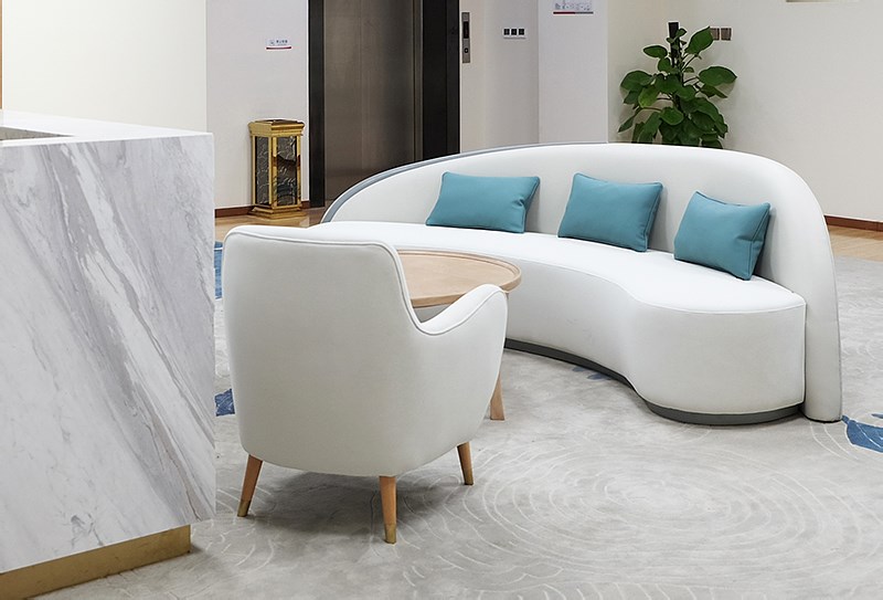
Purong Hotel Chengzhi Physical Examination Center Decoration Upgrade
蒲绒酒店诚志体检中心软装升级
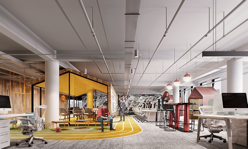
Beijing Ziroom Headquarters Office Project
北京自如总部办公项目
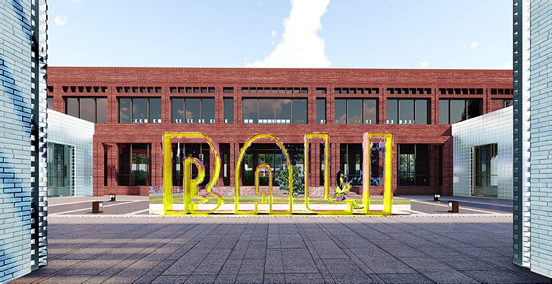
Tingsongtang
听松堂
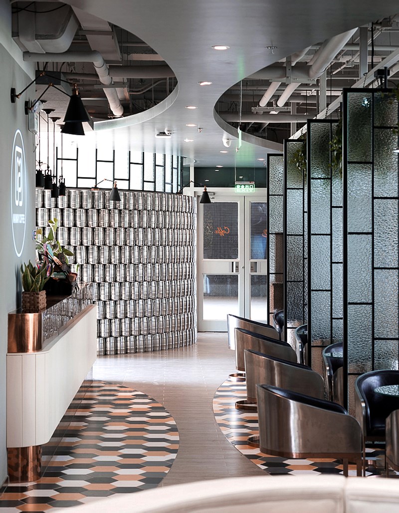
Maiway cafe
Maiway咖啡厅
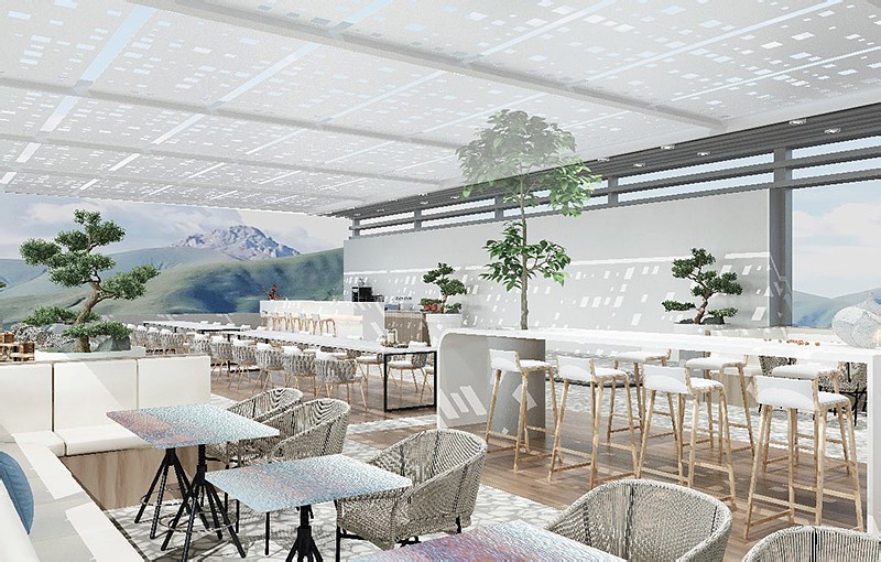
Fenghuangling Purong Health Management Center
凤凰岭蒲绒健康管理中心
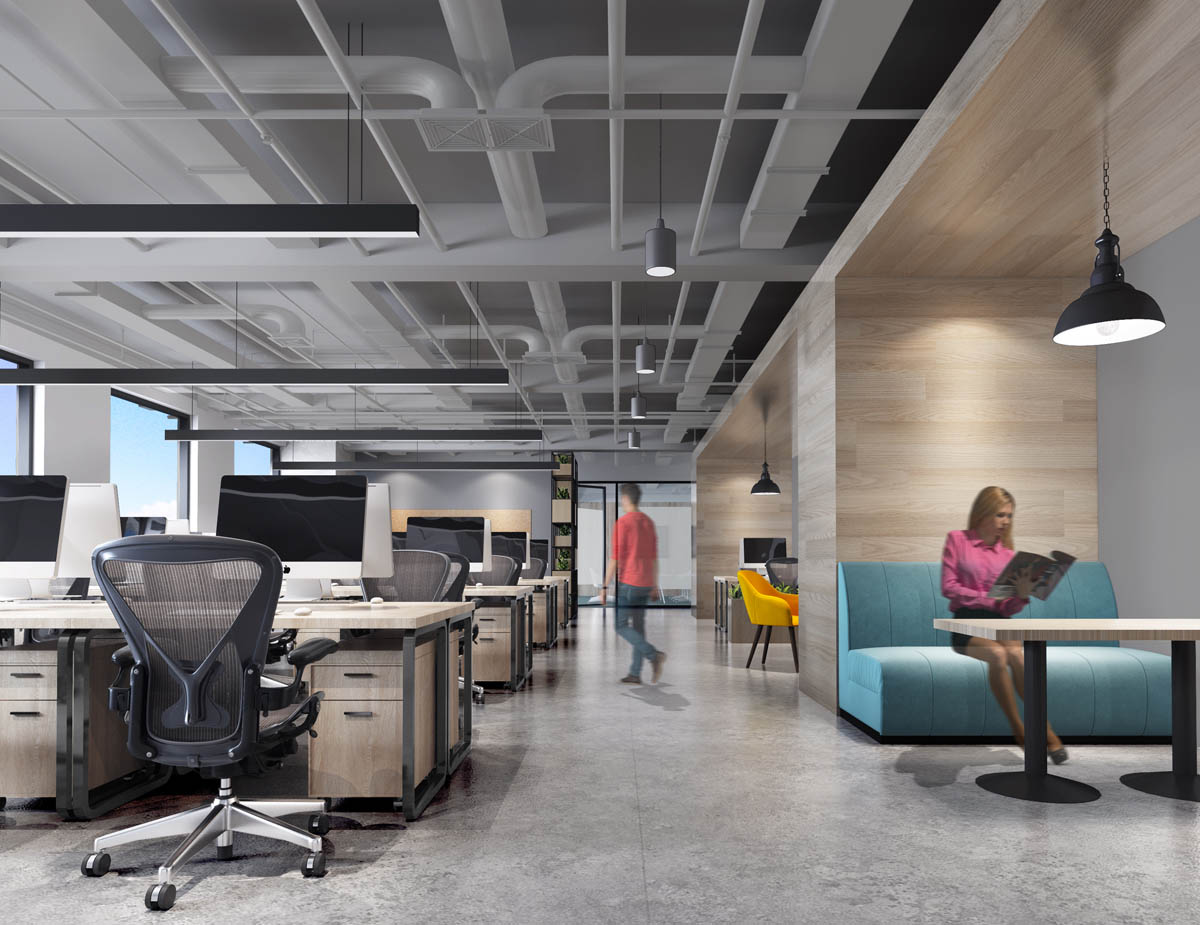
Country Garden Beijing Branch Office Space
碧桂园北京分公司办公空间
碧桂园集团是中国最大的新型城镇化住宅开发商。各类产品包括联体住宅及洋房等住宅区项目以及车位及商铺。同时亦开发及管理若干项目内的酒店,提升房地产项目的升值潜力。他是中国新型城镇化进程的身体力行者,是全球绿色生态智慧城市的建造者 ,作为五星级服务提供商,碧桂园秉承着让社会因企业的开发规划慢慢变得更加美好。碧桂园北京分公司办公空间由北京清石建筑设计咨询有限公司担纲设计。办公室装修是现代简约的设计风格。整个办公空间以开敞办公为主,使得各部门沟通非常便捷。作为连接办公区的走廊布局简洁大方,平顶加造型灯,搭配木质的墙面,突出了线条感。室内则采用直线和曲面很好的诠释出现代感,色彩简洁明快,被植物装点的角落,通过光影的运用效果在较小的空间内制造变化,耐看实用。接待区及会议区的家具选择非常时尚,和整体装修设计风格浑然一体。而作为最能看出整个公司水平,突显公司形象的前台,设计师选择了既不显突兀又能让空间更具有魅力白色大理石,细腻的自然纹络有着几分东方水墨意境。巧妙的是,山峦叠嶂曲线变化的天然材料从质地、图案也为大厅增添了一份自然之美。白色大理石无论在家居或着其他装修中,和实木都是一对模范性的绝配。实木的质朴雅致,白色大理石的简约洁净,二者合一,怎么看怎么清秀大方!木与石的灵魂合奏加上不规则几何美学,更显和谐高雅,温润质朴。这将现代简约化身为一种低调的奢华。
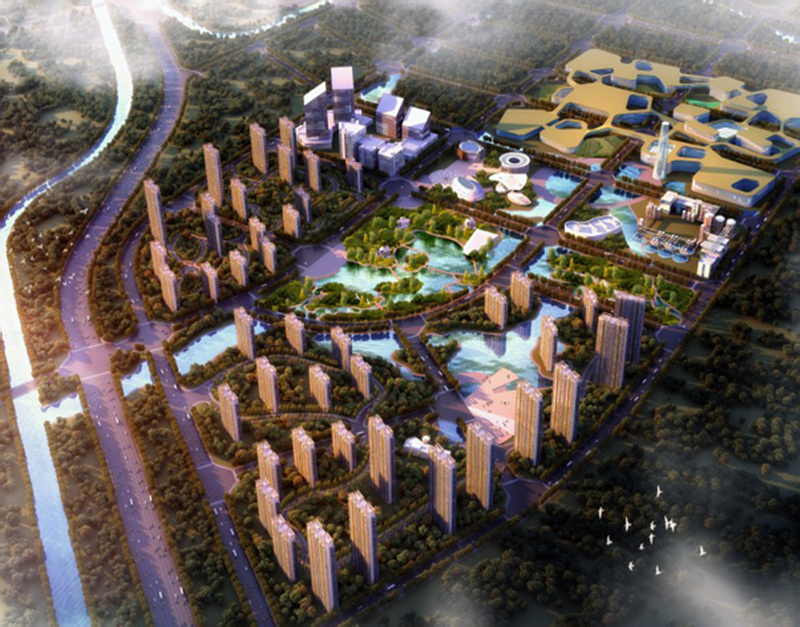
Beijing Tsinghua Industrial Innovation Park
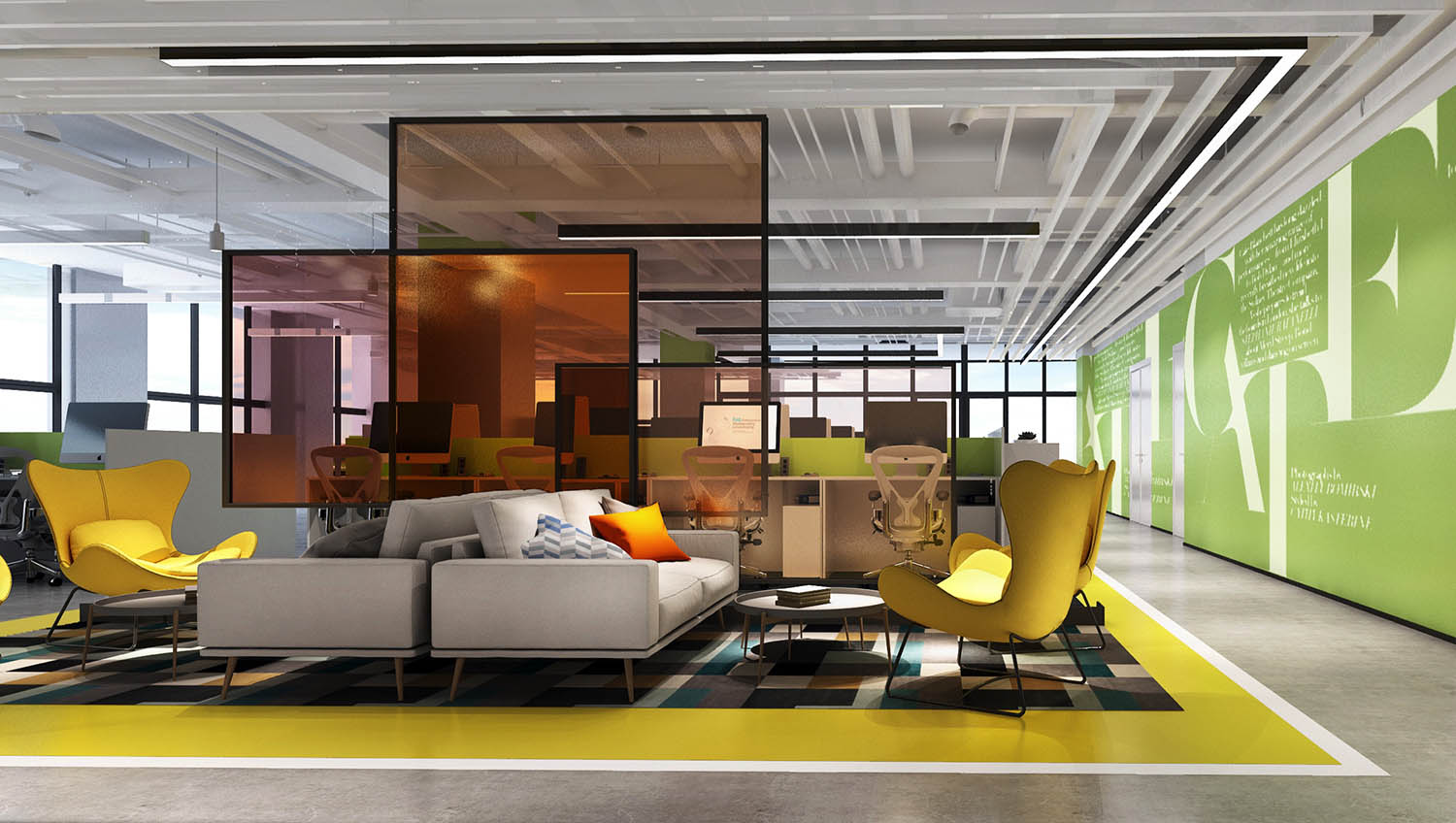
北京清华产业创新园
Renovation of Hanfu Holdings Headquarters Office Building
汉富控股总部办公楼改造
汉富控股有限公司是国内知名的资产管理公司,业务设计资产管理、不动产基金及家族信托等多个领域。其位于北京的总部办公空间经多年使用已无法匹配企业形象与企业未来发展需求,因此委托清石设计,希望在不影响员工正常办公的前提下完成室内办公空间的整体升级改造。通过局部拆改、更换材质搭配、重新设计有层次的照明系统、增加空间导视系统、整体软装设计搭配等设计手法,为汉富控股打造轻松舒适俱有人文气质的办公空间。Hanfu Holdings Co., Ltd. is a well-known asset management company in China, with business design asset management, real estate funds and family trusts. Its office space in Beijing's headquarters has been unable to match the corporate image and the future development needs of the company after many years of use. Therefore, it entrusted Qingshi Design and hoped to complete the overall upgrade of the indoor office space without affecting the normal work of employees. Through partial demolition, replacement of material mix, redesign of layered lighting system, increased space guidance system, overall soft design and other design methods, Hanfu Holdings has created an office space that is easy and comfortable.
COPYRIGHT (©) 2026 QUCESS 清石官网. 京ICP备11010571号
扫描二维码分享到微信