清石作品
Works
Dreams and journeys of discovery
梦想与探索之旅
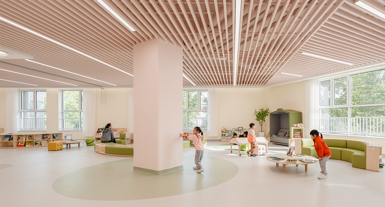
“梦想中的幼儿园,在这里有一辆可爱的小火车,它不仅是孩子们的梦幻交通工具,更是他们探索知识与想象力的起点。每一节车厢都装载着孩子们的梦想与探索之旅。”——圆梦我们曾经的青春。小火车缓缓启动,踏上了通往幼儿园的旅程。沿途,我们会经过一片片童话般的风景:高耸的城堡、翠绿的森林、绚丽的花园……孩子们可以坐上小火车,畅游幼儿园,发现世界的美好。在欢声笑语中,他们不仅仅是乘客,更是创造者和探险家。小火车不仅仅是一种交通工具,更是我们幼儿园的象征。它承载着我们对孩子们未来的憧憬和希望,让他们在欢乐中成长,驶向更美好的明天。奇幻城堡——梦想的起点 幼儿园的外立面仿若一座,等待着孩子们的探索。高耸的塔楼、华丽的尖顶和缤纷的色彩,勾勒出梦幻般的童话景象。每一扇窗户都是一个奇妙的世界,每一块砖瓦都散发着欢乐与活力。孩子们可以在这座奇幻城堡里畅游,探索未知的秘密,发现惊喜和快乐。这个外立面不仅是幼儿园的标志,更是孩子们梦想的起点,让他们在奇幻的世界中茁壮成长。落英缤纷——色彩探索在与郭浩老师的合作下,我们的空间设计将中国传统色彩巧妙融入,为孩子们打造一个充满文化底蕴与艺术氛围的幼儿园。首先,我们选择了月白、退红和半见这些富有中国传统意蕴的颜色作为主色调。通过墙上的壁画、卡通的图案等方式,将中国传统文化与现代教育相结合,为孩子们打造一个富有教育意义和艺术氛围的学习场所。我们相信这样的空间设计将为孩子们带来更多的启发与惊喜,让他们在欢乐与知识中茁壮成长。梦想工厂——趣味和创意幼儿园拥有12个主题教室,从科学实验到创意手工,从绘画故事到户外冒险,每一站都是孩子们心灵成长的驿站。▲剧场:一个充满戏剧和表演氛围的空间,孩子们可以扮演不同的角色,展现自己的想象力和表演才华。▲汽车与航空模型:这个教室里有各种汽车和飞机的模型,孩子们可以了解交通工具的原理和设计,并通过DIY活动制作自己的模型。▲卧室:一个舒适温馨的空间,让孩子们感受到家的温暖,可以进行阅读、休息和亲子互动等活动。▲花房:在这个教室里,孩子们可以接触到各种植物和花草,学习种植和养护的知识,感受大自然的美好。▲避险园:一个充满挑战和冒险的空间,孩子们可以进行团队合作和智力游戏,培养他们的勇气和毅力。▲光影院:通过光影的变化和投影技术,为孩子们带来视听盛宴,让他们沉浸在奇幻的影像世界中。▲迷宫:一个充满谜题和挑战的空间,孩子们可以进行探索和解密,锻炼他们的逻辑思维和团队合作能力。▲木偶剧院:在这个教室里,孩子们可以学习木偶表演和制作,创造自己的戏剧作品,培养他们的表达能力和想象力。▲造船厂:孩子们可以在这里学习船舶的结构和设计,进行船模制作和航海知识的学习,体验航海家的生活。▲二进制:一个专注于计算机编程和数字逻辑的空间,孩子们可以学习编程语言和创意编程,培养他们的计算思维和创新能力。▲传感:通过各种传感器和科技设备,让孩子们了解周围环境的变化和科学原理,激发他们对科技的兴趣和探索欲。▲化工厂:在这个教室里,孩子们可以进行简单的化学实验和手工制作,了解化学反应和材料科学,培养他们的实验精神和创造力。项目名称|西三旗花园一里 86 号楼装修改造工程项目地点|北京市海淀区项目面积|5545㎡项目时间|2023设计机构|QUCESS 清石设计设计指导|李怡明主案设计|王磊、周全贤、徐照斌设计团队|张傲研、莫宏琳、孟堃、王海申、张鑫、冯靖、严涛软装设计|胡琨、平凡 项目摄影|UOHO|建筑空间摄影- 陈军About QUCESS 关于清石由李怡明先生与徐瑛女士、吕翔先生于2005年共同创立的清石设计(以北京清石建筑设计咨询有限公司为核心的相关关联企业),一直致力于产业园规划与咨询、建筑室内一体化改造、办公及公寓空间设计、酒店会所等高端空间设计、软装设计服务,至今已发展成为超过百人的综合设计及服务企业。清石设计首次提出让设计创造价值。自创立至今,委托清石设计提供优质空间设计服务的各行业头部企业客户已超过百家。
Beijing Haidian Future School project
构筑梦想空间,点亮未来之光—北京海淀未来学校
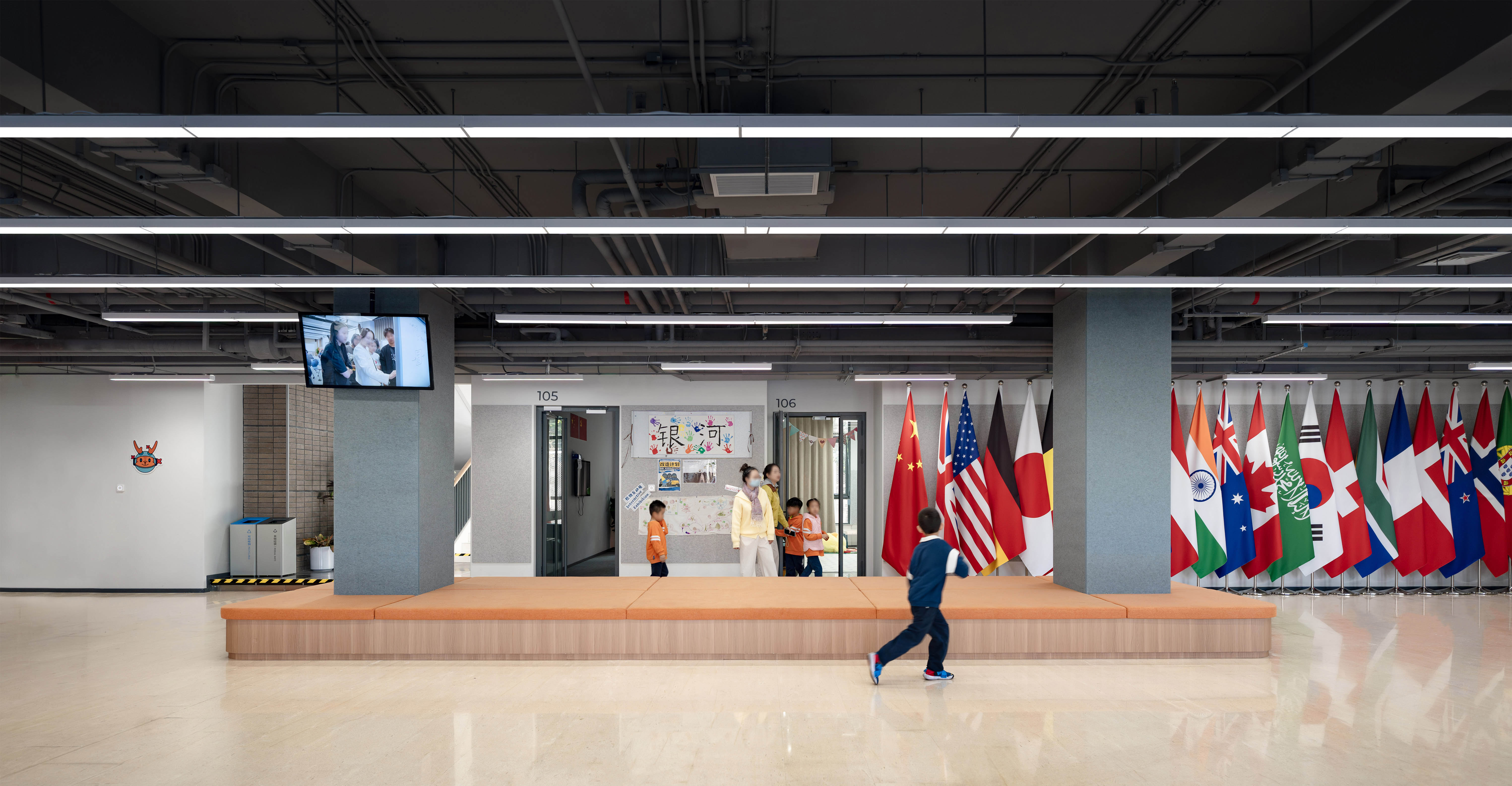
当下校园设计侧重点不再是崭新的环境和浮夸的造型,而是校园环境为学生成长提供最有效的助力,并且我们认为校园校园空间设计要与学校的教学理念存在紧密的联系,为孩子营造一个适合孩子成长、调动学习积极性及激发孩子学习热情的环境。 本项目位于北京市海淀区东升科技园北领地内,占地面积80余亩,建筑面积约3.2万平方米,学校秉持“一朝入校,终身护航”的使命,遵循“发现天生不同、成就与众不同”的办学理念,致力于培养“能够点亮自我,温暖社会”的生命个体; - 简约而不简单 - 本次设计建筑外立面进行利旧处理,保留建筑原有的形态是对历史痕迹最好的尊重,让学生了解该建筑的过往和曾经的功能,这种历史价值可以让学生更好地了解建筑本身。 现状地面存在较多设备井盖,通过艺术装置进行遮挡,既可以美化校园又可以丰富学生课余活动; 黄丹/天水碧/帝释青取自画家林风眠作品《山水》黄丹色-太阳升起-照样升起希望大地;天水碧-雨过天晴-夜雨出初晴清风徐来;帝释青-望向宇宙-极目宇宙耀眼星辰。 黄丹、天水碧、帝释青三种颜色运用到小学、初中、高中三个学习社区交通枢纽既通过色彩对学习社区的区分又起到交通引导作用。 - 多样化教学空间 - 正对入口的超大卡座成为孩子下课嬉戏活动的最佳场所(利用利旧水系改造) 各楼层临近电梯厅配备共享学习区,整个区域没有隔断,空间连续整体;学习区家具按照组团分布便于学生小组学习讨论。 阶梯和平台设置大量驻足停留区域以促进师生交流、休闲阅读及团队路演等活动。 设计中采取留白方式,不限定其空间功能性质,留给教学活动充分的扩展空间,可移动的课桌椅,满足教师随时上课、学生随时发表意见的活动需求。 校园环境应该符合新时代的教育理念,不断模糊校园与非校园的界限,秉持理念先行的原则,先有教育,再有空间。项目名称|东升科技园D区-北京海淀未来学校项目地点|北京市海淀区项目面积|1.9万㎡项目时间|2023设计机构|QUCESS 清石设计设计指导|李怡明方案设计|张傲研、王学丽、冯浩林、张志浩设计团队|吉世超、冯靖、韩张生、李若楠、于亚男、莫宏琳、孟堃灯光设计|高赞项目摄影|UOHO|建筑空间摄影-陈军About QUCESS 关于清石由李怡明先生与徐瑛女士、吕翔先生于2005年共同创立的清石设计(以北京清石建筑设计咨询有限公司为核心的相关关联企业),一直致力于产业园规划与咨询、建筑室内一体化改造、办公及公寓空间设计、酒店会所等高端空间设计、软装设计服务,至今已发展成为超过百人的综合设计及服务企业。清石设计首次提出让设计创造价值。自创立至今,委托清石设计提供优质空间设计服务的各行业头部企业客户已超过百家。
Daxing International hydrogen energy Demonstration zone member restaurant
甜蜜的巧克力——大兴国际氢能示范区员区餐厅
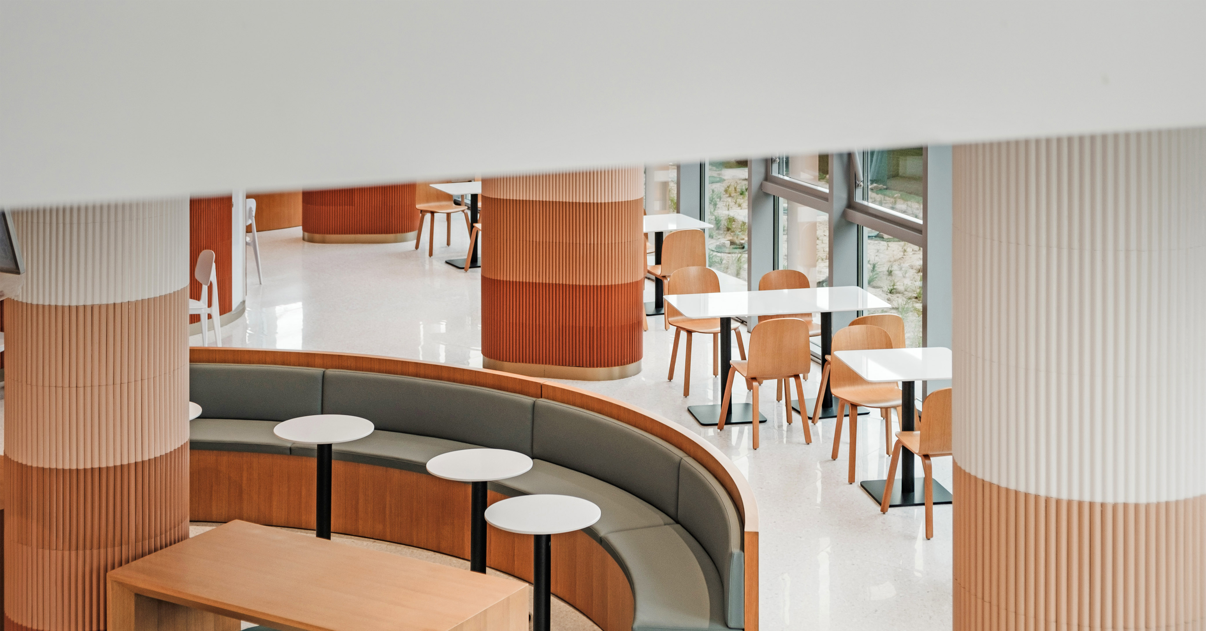
本项目位于大兴国际氢能示范区中心景观区,此次的设计主旨是营造一个放松、舒适的园区餐厅,在坚硬建筑外壳中注入生机满满的醇厚与绵密,成为钢铁森林的避风港,如融化的巧克力般温暖接纳每个人。01/当阳光与自然 顺势而来设计团队充分利用原有空间挑空区域,使室内布局与外部建筑景观绿化相互呼应,旨在创造一个充满阳光与自然元素的餐厅,让人在享受美食的同时,感受到大自然的清新与活力。通过将自然光线、自然色彩以及自然元素融入设计,营造出一个舒适、自然、健康的用餐环境。透明玻璃外幕墙将室内空间与外部空间相连接,将自然的“光和绿”引入室内,最大程度地利用自然光线,让室内充满充足的阳光。空间在绿意盎然中展开,并以开放姿态接纳自然风景的融入。搭配木质元素的家具,给人带来温馨、自然的感觉。02/当生活与色彩 甜蜜相拥 以棕褐色调组合成温暖的巧克力色盘,用醇厚的大地色系为空间渲染出一种舒适的氛围,使园区客户悠享惬意的用餐时间,为繁忙的日常生活增添一抹甜蜜色彩。设计中使用木饰面、仿水磨石地砖,与室内点缀生命原色土色和红色桌椅家居单品相互映,为空间带来毫不违和的层次感和视觉张力。以巧克力为主题色调,通过深浅不同的巧克力色系,营造出层次感,旨在创造一个浪漫、温馨、充满甜蜜幸福感的就餐环境。03/当丝滑的弧线 流动其中流畅的线条贯穿整个空间,柔化空间,延伸视觉感受,使空间更加柔和有温度的同时,增加了艺术气质和趣味性。项目名称|中国大兴国际氢能示范区-员工餐厅项目地点|北京市大兴区项目运营|水木兴创 X i站项目面积|2083㎡项目时间|2023设计机构|QUCESS 清石设计设计指导|李怡明主案设计|王学丽、杨国强设计团队|吉世超 张志浩 张傲研 韩张生 王海申 裴海婕软装设计|胡琨 杨一诺 平凡 罗云项目摄影|UOHO|建筑空间摄影 - 陈军
Limtec headquarters office design project
连接与共生—力姆泰克总部设计
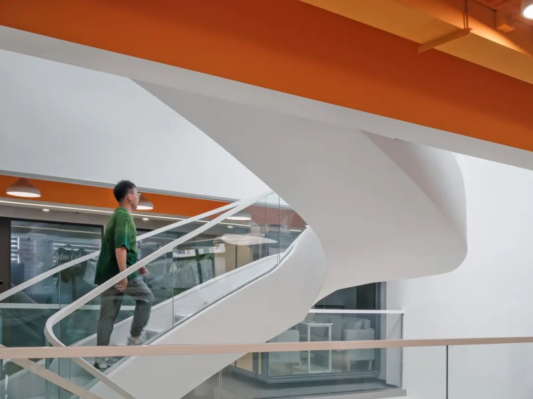
力姆泰克是一家以传动设备为核心产品的制造企业,清石设计的办公事业部-Eco Work受邀为其打造全新的总部办公。业主对新总部的愿景是希望传达一个开放、创新、加强员工联系的办公空间,以增强员工幸福感、归属感,提高生产力,传递全新的企业形象。「连接×共生」建筑与室内和谐共生的理念该项目原为生产厂房,Eco Work对其建筑、室内进行一体化改造,以满足办公总部对于企业形象和办公环境的需求。在项目伊始,设计师通过对业主品牌、产品及建筑现状进行整体分析,确定了以“连接”作为本案的核心设计理念,通过建筑与室内设计的整体规划和布局,为使用者提供一个舒适、健康、充满活力的工作环境,为业主传递一个开放、品质、现代的品牌形象。基于以上愿景和设计理念,通过对建筑室内的一体化设计,将原建筑实体外墙更换为简洁精致的玻璃幕墙,以传递高品质的企业形象。将原建筑南侧墙体外扩,为前厅加入高挑空空间,以体现企业气度,在室内引入更丰富的自然光线。「共享×开放」大气、简洁、开放的展示中心前厅与企业展厅相融合,GRG定制椭圆前台与旋转楼梯相呼应,展示区围绕整个前厅,形成一个简洁、开放、大气的展示空间。设计师将建筑中心局部开洞,顶面增加玻璃天窗,形成采光井贯穿各楼层,为室内中心引入自然采光,削弱层高低带来的采光劣势。「活力×创新」活力、创新的协作办公空间开敞办公区与开放交流区、多人会议室、多功能厅相邻,促进部门交叉协作、社交活动,提升沟通频率,提高工作效率。在功能布局上,一层为企业展示中心,二层为协作办公空间,三层为独立办公空间。在空间设计上,从业主产品中提取核心元素——圆,在空间中不同界面上,以不同的材料、形式呈现。在采光井增加旋转楼梯,连接各楼层,让竖向交通更便利,同时模糊室内外边界,形成开放的室内空间,带来更多自然采光,让内部空间更加宜人。清石设计-Eco Work专项办公空间设计团队与力姆泰克共同创造了一个开放、简洁、创新的企业总部。未来,我们将与更多优秀企业合作,为客户提供面向未来、可持续的办公空间解决方案。项目名称|力姆泰克传动设备有限公司 项目地点|河北廊坊项目面积|3650㎡项目时间|2022设计机构|清石设计 EcoWork办公事业部设计指导|李怡明主案设计|王 磊 张志浩 冯浩林 徐照宾 丁亚男 设计团队|王海申 杨 伟 王 旭 代鑫妍 康佳音 高 赞 项目摄影|UOHO|建筑空间摄影 - 陈军
Qingdao Citizen Center
青岛市民中心
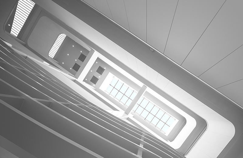
当建筑不再只是建筑本身,而与城市功能搭脉相连,都市生活也就谱写出了更多的多样性。青岛市民中心是清石设计与北京中景昊天工程设计有限公司对于建筑改造与城市更新的又一个实践项目,同时也是室内与建筑的新陈代谢设计理论又一次输出和实践。起点——如何将废旧商场改造为市民中心?青岛市民中心由一栋空置近十年的商业建筑改造。原商场由一栋11层塔楼和4层裙楼组成,建筑之前的功能是商场,层高较低同时空间进深小,整体比较狭长,跟市民中心需要的大尺度公共空间,在空间尺度与使用上差别较大,加上项目周期短预算紧,如何才能将市民中心的功能有效融入原有的商业空间?以及梳理出流畅的空间功能流线和舒适的空间体验?改造后的青岛市民中心集中了二十多家市级委办局将在此集中办公,为全市居民、企业提供包括民生、社保、税务、公安、出入境、公共资源交易、投资建设、市场准入、社会综合管理等提供一站式服务。空间改造功能需求的复杂性可想而知,如何对待平衡旧建筑与新需求的关系,为市民提供真正的便利,成为设计思考的起点。清石设计给出了诗意且富有哲理的回答:诗意:光的对面是彩虹。将自然光引入室内空间,同时彩虹渐变作为基础配色元素植入室内空间中。哲理:奥卡姆剃刀定律(Occam's Razor, Ockham's Razor)又称“奥康的剃刀”,这个原理称为“如无必要,勿增实体”,即“简单有效原理”。改造策略——办事大厅小型化我们提出市民服务大厅的改造策略是:大厅小型化,在保持原有空间结构的基础上,通过灯光、导视系统和空间色彩将不同的办事单元串联在一起。同时办事大厅小型化让空间尺度更加亲人,为市民们在办事大厅等候或者办理业务营造一种在家的亲切感。办事大厅的“客厅化”设计风格创造舒适、宁静的室内空间氛围,满足市民在等待过程中的心理需求。等候区家具挑选的原则是能够让人们在这里呆更长时间,因此我们为市民提供多样性的选择,但是只有一个舒适的目标。改造策略——以空间色彩组织流线我们不仅仅是将一个大结构体分解成一系列组合体的整合,更重要的是创造多种级别的空间和不同环境的相互渗透。这种相互交织的空间组织,满足更多向的互动交流的同时,也使空间利用更有效便捷,为更多种形式的活动提供灵活的环境支持。市民服务大厅的功能组织与各种活动息息相关,所以简洁、清晰的流线组织以及明显的等待区域设计都至关重要。我们希望通过室内色彩设计为使用者提供清晰明确的室内引导。因此我们将彩虹渐变作为基础配色元素植入室内空间中。不同楼层的标识、窗口指示牌以及家具都遵循统一种色彩渐变原则,这样的空间色彩搭配从潜意识中引导市民快速准确的定位自己所在的位置,引导他们到达最终的目的地。在动线规划方面,因原始建筑属性为商业空间,交通疏散设置较多,针对新的功能需求,我们通过梳理专家流线、行政审批内部流线、投标人流线、综合大厅办事人员流线以及综合大厅等五条重要流线,将裙楼东侧的部分电梯及楼梯在满足消防规范前提下做了适当的拆除,以提高空间的利用率。同时增加专用电梯,同时将主扶梯在竖向空间维度延长至顶层,充分满足了竖向的交通连续性需求。改造策略——引“光”入室项目本身作为大型公共服务空间,职能空间本身已经被赋予了“阳光”“开放” 的公众印象和标签。因此充分的自然采光似乎是市民中心必备的精神气质,为了契合公众对市民中心的潜在期待,我们在原商场建筑的三个中庭上设置了大面积的天窗,让阳光能够通过中庭洒向室内。通过重新规划墙体分隔和竖向交通让室内空间获得更充分的自然采光,配合人工光带的分布,让空间符合市民对大型公共服务空间的期待。改造策略——细节体现品质改造设计过程中,设计师充分考虑工作人员办公环境的优化。合理的采光设置,工作休息区的结合,人性化的办公家具选择,空间绿色的植入,这些都让长时间在这个空间中的工作人员有舒适的办公环境,优质的环境与优质的服务相辅相成。在材料语言的解读上,我们使用颜色编织地毯、定制编织地毯、超白钢化背漆玻璃、白色烤瓷铝板、木纹转印铝板、仿地毯地砖、木纹铝吸音板等经济牢固的材料,渗透在观者的感官里,以诉说着城市的沧桑岁月和文化内涵。每个人对青岛这座座城市,都有深深的理解,环境亦如斯,建筑亦如斯,室内空间亦如斯。后疫情时代人类将要面临的诸多课题,这是后疫情时代带来的深邃思考,是人类文明走向“重生”的过程,实现以眼观,以心去觉察,去感叹经过重新设计规划的市民中心,恢复了往日的活力,相信好的设计能够不断自我更新,为城市赋能。空间以它的方式和力量为都市人注入能量,在轻微却不间断的新陈代谢中,塑造新生。When architecture is no longer just a building itself, but is connected to the city's functions, urban life, this also composes more diversity. Qingdao Citizen Center is another practical project design of Qingshi Design and Beijing Zhongjing Haotian Engineering Design Co., Ltd. for architectural renovation and urban renewal. It’s also another practical output of interior and architectural metabolism design theory.How to transform an old shopping mall into a Citizen Center?Qingdao Citizen Center was transformed from a commercial building that had been vacant for nearly ten years. The original shopping mall consisted in 11-floor tower and a 4-floor podium, the previous function of the building was a shopping mall, the floor height is not high and the space depth is small, overall is relatively narrow and long, the large-scale public space needed by the citizen center is quite different in terms of spatial scale and use, coupled with the short project cycle and tighten budget - how can the functions of the citizen center be effectively integrated into the original commercial space? And how sort out the smooth spatial function streamline and comfortable spatial experience?More than 20 Municipal Committees and Bureaus will be concentrated in the reconstruction of Qingdao Citizen Center, providing people’s livelihood for residents of the city, social security, taxation, public security, immigration, public resource transactions, investment construction, marketing access, providing one-stop service for comprehensive social management and much more. The complexity of the functional requirements of space reconstruction can be imagined, so how to balance the relationship between the old buildings and the new requirements, providing real convenience to the citizens, became the starting point of the design idea.Qingshi Design gave a poetic and philosophical answer:-Poetry: Opposite the light is the rainbow. Natural light is introduced into the indoor space, and the rainbow gradient is used as a basic colour element to be implanted in the indoor space.-Philosophy: Occam's Razor Law is also known as “O'Connell's Razor", this principle is called "if not necessary, do not add entities", that is, "simple and effective principle".Strategy: Miniaturization of the office hallWe propose that the transformation strategy of the Citizen Service Hall is: The hall is miniaturized, and on the basis of maintaining the original spatial structure, different service units are connected in series through lighting, guidance systems and spatial colours. At the same time, the miniaturization of the office hall makes the scale of the space more relative, creating a sense of intimacy at home for citizens waiting in the office hall or handling business.The "living room" design style of the office hall creates a comfortable and quiet indoor space atmosphere and meets the psychological needs of the citizens in the waiting process. The principle of the selection of the furniture in the waiting area is to allow people to stay there longer, so we provide citizens with a variety of choices, but there is only one comfortable purpose.Strategy: Organizing streamlines with spatial coloursIt is not only decomposing a large structure into a series of integrations, but more importantly, creating multiple levels of space and mutual penetration of different environments. This mutually mingled space organization meets more directional interactions and, at the same time, makes space utilization more efficient and convenient, and provides flexible environmental support for more types of activities.The functional organization of the citizen service hall is closely related to many activities, so concise and clear streamline organization and obvious waiting area design are essential. We hope to provide users with clear and easy-going indoor guidance through indoor colour design. Therefore, we use the rainbow gradient as the basic colour element to implant the indoor space. The signs, window and furniture on different floors all follow the same colour gradation principle. Such spatial colour matching subconsciously guides citizens to a quickly and accurate perception of their current location and guide them to their final destination.In terms of traffic planning, since the original building is a commercial space, there are many traffic evacuation facilities. In response to new functional requirements, we sorted out the streamlines such as expert streamlines, internal streamline of administrative, bidder streamline, five important circulation streamlines, including the staff streamline of the comprehensive lobby, some elevators and stairs on the east side of the podium were properly demolished under the premise of meeting the fire protection regulations, also, in order to improve the utilization of space, at the same time special elevators are added, and the main escalator is extended to the top floor in the vertical space dimension, which fully meets the demand for vertical traffic flow continuity.Strategy: Bring "light" into the roomThe project itself is a large-scale public service space, and the functional space itself has been given the public impression and label of "sunshine" and "open". Therefore, sufficient natural lighting seems to be a necessary spiritual temperament for the Citizen Center. In order to meet the public's potential expectations for it, we set up large skylights in the three atriums of the original shopping mall building to allow the sunlight to spill into the interior through the atrium. By re-planning the wall partition and vertical traffic, the indoor space can get more natural lighting, and with the distribution of artificial lights, the space can meet the expectations of the public for large-scale public service spaces.Strategy:Details reflect qualityIn the process of renewal of the design, the designer team fully considers the optimization of the staff’s office environment. Reasonable lighting settings, the combination of work areas with rest areas, the selection of user-friendly office furniture, and the green implantation in the space, all enable the staff, who have been in this space for a long time, to have a comfortable office environment. The high-quality environment and the high-quality service complement each other.In the interpretation of material language, we use colour woven carpets, customized woven carpets, ultra-white tempered back-painted glass, white porcelain aluminium plates, wood grain plates, imitation carpet of floor tiles, wood grain aluminium sound-absorbing panels and other economically strong materials. Infiltrating the senses of the viewer to tell the vicissitudes of the city and its cultural connotations.Everyone has a deep understanding of the city of Qingdao, the environment is the same, the architecture is the same, and the interior space is the same. The many issues that mankind will face in the post-epidemic era is the profound thinking brought about by the post-epidemic era. It is the process of human civilization’s "rebirth", realizing the realization of seeing and perceiving with the heart, and lamenting the redesigned and planned Citizen Center, restoring the vitality of the past, and believing that good design can constantly renew itself and empower the city. Space injects energy into urbanites with its way and power, and creates new life in a slight but uninterrupted metabolism.

Zhongguancun Chuangye Street·Taili Station
中关村创业大街·泰利驿站
在中国创新创业资源最为密集的中关村核心区域,全长仅220米的创业大街如同这座城市中一条汩汩流淌的血脉,涌动着为高速奔跑的城市输送氧气。2020年9月,由清石设计改造完成的泰利驿站中关村大街站在创业大街北口落成,这座24小时对外开放的复合空间向城市和穿梭其中的都市人提供了一个不同以往的落脚处,除了显而易见的功能空间以外,它更像是一个小型能量泵,为城市的一呼一吸注入能量,共同完成它日复一日的新陈代谢。同时,这也是清石设计新陈代谢设计观的一次全方向实践。空间之于城市,一呼一吸之间,一次微新陈代谢.当新陈代谢的设计理念被设计师注入空间重建时,泰利驿站便不再只是街口的一座新空间而已。设计师保留了原空间的大部分骨架,在旧有基础上进行了空间的延伸、重构,将其改造为结合了开放、半开放与封闭区域的新空间。从室外步入室内的过程,情绪也从喧闹过度到舒缓平和,直到整个复合型空间完全呈现在眼前,你便可以挑选中意的区域落脚。对于吐故纳新的泰利驿站来说,再设计的过程本身就是一次空间的自我新陈代谢,而一座新空间的诞生之于城市,也是一次微小却力道精妙的更迭。这个正缓慢新陈代谢的复合庭院就像一座迷你城市,繁忙的都市人进入其中,在交错层叠的微景观里舒缓精神;在物理赋能的设施辅助下补充体力;在精心设计的场景中按下时间的缓慢倍速按钮……再次出发时,人们轻装简从、眼神明亮,这是一处微小空间对城市的贡献,而城市也在这样的焕新和赋能中,完成着属于它的新陈代谢。空间之于人,一呼一吸之间,一次减“负”与“赋”能.为了让空间达到为人们“减负”从而“赋能”的效果,清石设计将丰富的功能和使用场景恰到好处地植入空间,并利用清新简洁的色彩使用和景观叠加进行强化。小型分享区、吧台、临窗工作区、会议区、卡座区、夹层区等等区域分别承载着不同的功能需求,环形动线将一层到夹层的功能区依次串联,在丰富的场景叠加下,刻板单一的空间面貌不复存在,如同一个微缩的复合型社区,即便只是方寸地,却也能游刃有余地匹配各种需求。景观是空间中的重要组成部分,植物缓慢呼吸,释放氧气,在喧闹的中关村街景映衬下,它们仿佛是静止的。不同形态的绿色植物构成一个个微景观,移步异景,植物在不同的功能区域之间静置,自成天地。被植物环抱的空间中,时间轻盈缓慢地流动,吸附二氧化碳的同时,也滤掉了人们的焦灼和不安。纯净安逸的白色和绿色基底上,砾石、缸砖、铁艺、水磨石等户外元素也延续了质朴自然的空间气质,不动声色间与自然环境融合,最大程度地舒缓着进入者的情绪,新的能量随之渐渐鼓动。空间之于时间,一呼一吸之间,24小时的往复循环.清晨7:30,在上班族扣上衬衫的第一颗扣子前,窗边的单人扶手沙发和小圆桌还能提供一杯热咖啡的时间。或者是倚在门口的吧台边,在肯尼亚豆子的香气里,看着窗外匆匆人群奢侈地出会儿神,直到看见熟悉的同事,结伴而出。上午10:00,吧台前的工作台边是创业者正进行的小型会议,一场头脑风暴后,他们在夹层区域享受简单的午餐。中午12:00,按摩沙发区是午后的热门“打卡地”,有人在沙发区“回血”,而兴致高昂的年轻同事继续在夹层区埋头创作。下午15:00,卡座区的一场讨论会刚刚结束,专项小组的研究会议则刚刚在中型会议空间拉开序幕。傍晚,灯光亮起的庭院和空间变得迷人。酒吧区域每晚都有一场微型欢聚,创业者在轻声的雀跃中结识新朋友;专属会员区内,有人意兴阑珊捧着咖啡,也有人似是准备奋战一个通宵。深夜,睡眠舱中是第二天要赶早班机的市场经理,在城市的角落里,正进入深沉睡眠……空间24小时一刻不停歇,而无论是哪一刻进入其中,空间都以它的方式和力量为都市人注入能量,在轻微却不间断的新陈代谢中,塑造新生。In the core area of Zhongguancun, China's most intensive resource for innovation and entrepreneurship, the Entrepreneur Street with a total length of only 220 meters is like a gurgling blood in the city, surging to deliver oxygen to the fast-running city.In September 2020, the Taili Station Zhongguancun Street, which was designed and renovated by Qingshi, was completed at the north exit of Chuangye Street. This 24-hour open complex space provides the city and the urbanites with a different foothold. In addition to the obvious functional space, it is more like a small energy pump, injecting energy into the city's exhalation and inhalation, and jointly completing its daily metabolism. At the same time, this is also an all-directional practice of Qingshi Design's Metabolic Design Concept.Space is in the city, one breath and one breath, a micro metabolism.When the design concept of metabolism was injected into the space by the designer, Taili Station was no longer just a new space at the corner of the street. The designer retains most of the skeleton of the original space, extends and reconstructs the space based on the old one, and transforms it into a new space that combines open, semi-open and closed areas. From the outdoor into the indoor process, the mood also changes from noisy to soothing and peaceful, until the entire complex space is fully presented in front of you, you can choose the area you like to settle down. For the new Taili Station, the process of redesign itself is a self-renewal of space, and the birth of a new space in the city is also a small but subtle change. This slowly metabolizing compound courtyard is like a mini city, where busy urbanites enter, soothe their spirits in the interlaced micro landscape; supplement their physical strength with the aid of physically empowered facilities; press time in the carefully designed scene The slow and double speed button... When we set off again, people are lightly packed and simple, with bright eyes. This is a small space's contribution to the city, and the city is also completing its metabolism in such renewal and empowerment.Space is for people, with one exhalation and one inhalation, reducing the "negative" and "empowerment".In order to make the space achieve the effect of "reducing the burden" for people and thus "empowering", Qingshi Design appropriately implants rich functions and usage scenarios into the space, and uses fresh and concise color use and landscape superposition to enhance it. The small sharing area, bar counter, window-side working area, meeting area, deck area, mezzanine area and other areas respectively carry different functional requirements. The circular moving line connects the functional areas from the first floor to the mezzanine in sequence, overlapping in a rich scene Under the circumstances, the stereotyped and single spatial appearance no longer exists, just like a miniature composite community, even if it is only a square inch, it can still meet various needs with ease. The landscape is an important part of the space. Plants breathe slowly and release oxygen. Against the backdrop of the noisy streetscape of Zhongguancun, they seem to be still. Different forms of green plants constitute a micro-landscape, moving in different sceneries, and plants are standing still among different functional areas, forming a world of their own. In the space surrounded by plants, time flows lightly and slowly, while absorbing carbon dioxide, it also filters out people's anxiety and anxiety. On the pure and comfortable white and green base, outdoor elements such as gravel, clinker, iron, and terrazzo also continue the simple and natural spatial temperament, and blend in with the natural environment in a calm manner, so as to soothe the emotions of the entrants to the greatest extent. The energy gradually agitated.Space is to time, a 24-hour reciprocating cycle between breathing and breathing.At 7:30 in the morning, before office workers button the first button of their shirts, the single-handle sofa and small round table by the window can also provide time for a cup of hot coffee. Or leaning against the bar at the door, in the aroma of Kenyan beans, watching the rushing crowd outside the window luxuriate for a while, until I see a familiar colleague and come out together. At 10:00 in the morning, next to the work table in front of the bar is a small meeting of entrepreneurs. After a brainstorming session, they enjoy a simple lunch in the mezzanine area. At 12:00 noon, the massage sofa area is a popular "punch-in place" in the afternoon. Some people "recover blood" in the sofa area, while young colleagues with high enthusiasm continue to work in the mezzanine area. At 15:00 in the afternoon, a discussion meeting in the deck area has just ended, and the research meeting of the special group has just kicked off in a medium-sized meeting space. In the evening, the illuminated courtyard and space become charming. Every night in the bar area,there is a mini-gathering where entrepreneurs meet new friends in a soft joy; in the exclusive member area, some people are holding coffee in a desperate way, and some seem to be preparing to fight all night. In the middle of the night, in the sleeping cabin is the marketing manager who wants to catch the early flight the next day. In the corner of the city, he is entering a deep sleep...The space is 24 hours a day without a break, and no matter where you enter it, the space is harmonious in its own way. Power injects energy into urbanites, shaping new life in a slight but uninterrupted metabolism.
Diamond Center Restaurant
钻石中心餐厅
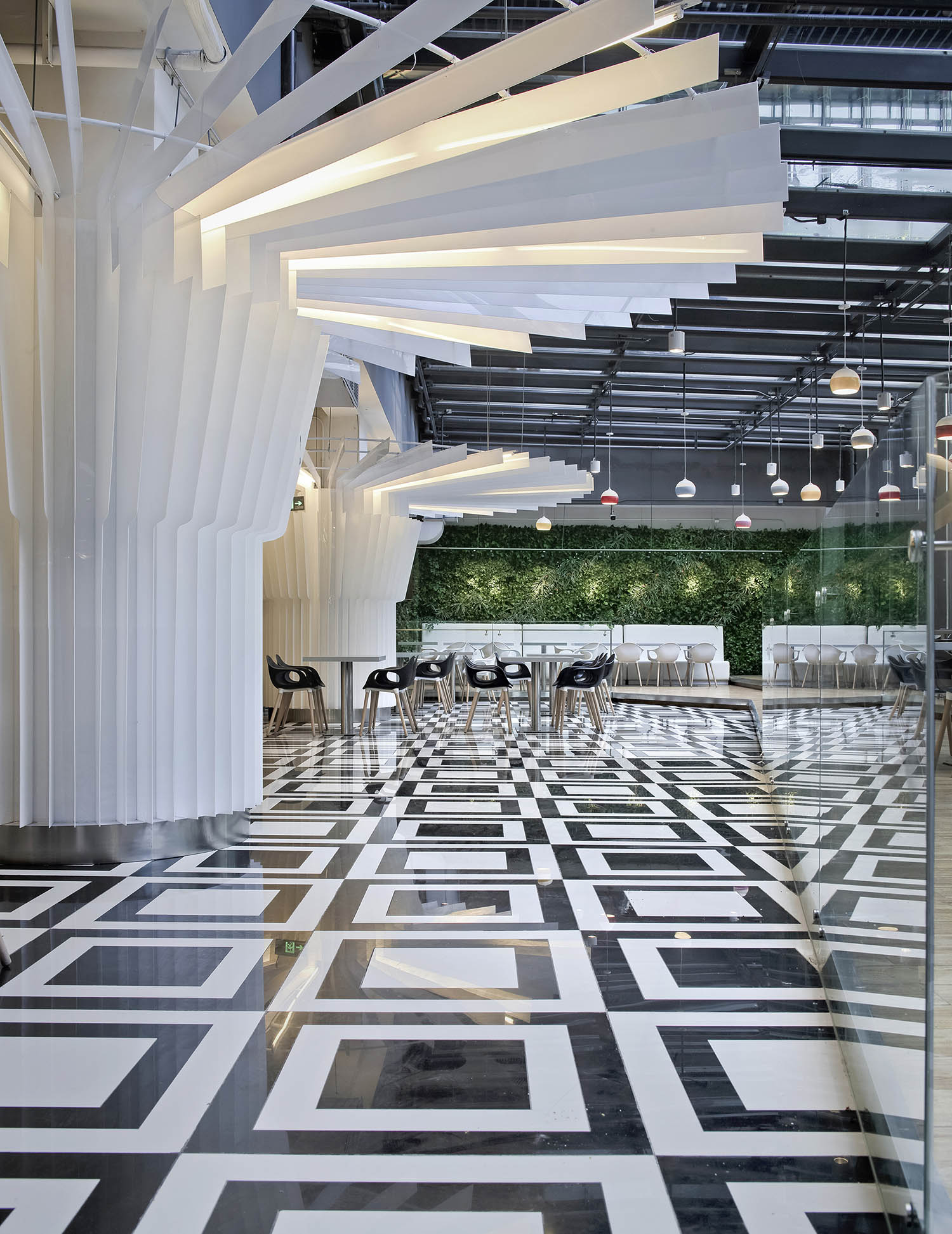
本项目是一个超低造价要求的员工餐厅,餐厅位于地下二层,其中的一部分空间通过采光玻璃天棚和玻璃幕墙得到自然的采光与通风。我们的任务是尽可能的利用现有的各种条件去降低造价,并达到最优的效果。具体的策略是从现有的柱子入手,以伞的剖面为元素,采用白色的亚克力片包围柱子,形成伞的形态。并且对于每个柱子,我们把它装饰成了略微不同的各种伞的形状。这些伞的形状从采光玻璃天棚区域一直延伸到内部,意图为内部的黑暗空间带来室外阳光的氛围。地面选用了最容易清洁并廉价的玻化砖,用了模数化的黑白图案棋盘式的拼花,在完全没有浪费任何材料的同时,给空间带来了强烈的动感以及现代艺术、时尚的气息。在采光天棚上,我们加入了一些多彩的小吊灯,宛如雨滴。整个空间就像是一幕在雨中翩翩起舞的场景,在;伞下以及雨中就餐的的空间氛围显得非常的有趣。采光玻璃上设计有流动的水幕,夏天反射日光,并利用水的温度给室内降温,冬天关闭水幕,引入阳光,形成温室效应,保证了室内温度。靠近采光玻璃天棚以及侧窗的地方,我们加入了仿真绿植墙。阳光、绿植、水、等自然的元素,为整个地下员工餐厅带来了无限的生机与活力。 As required by the owner, the project is a low cost renovation project. It is a canteen at B2 floor, with part of the ceiling in glass and curtain wall in glass for natural lighting and ventilation. Our task is to maximally utilize the existing conditions to achieve the optical effects.White acrylic plates with the same shape are applied to decorate the columns to be umbrella shapes. Each column is designed into slightly different umbrella shapes. The “umbrellas” extend from the ceiling in glass to the interior to introduce the outdoor sunshine into the interior dark space. Parquet floor tile in white and black is utilized by modular design to avoid any waste. Besides, the parquet floor tiles are cost effective and easy to maintenance. The space is irritated with intensive motions. Modern and fashionable arts atmosphere are created as well. The ceiling is additionally decorated by little droplights while reserving the original ceiling lights. The general space is like dancing in the rain. To dine under the “umbrellas” and in the rain, the images arising from the atmosphere are quite interesting.Part of the roof is in the hollow low-e glass with water curtains. In summer, the glass will reflect the sunshine and reduce the temperature through water inside. In winter, the water curtains could be closed and sunshine could be introduced into the room to form greenhouse effects to maintain the interior temperature. The interior walls close to the glass curtain and side windows are decorated by green plants. The floor close to plant walls and windows is designed to use wood-like tiles with longer durability for easier maintenance. The natural elements including sunshine, green plants and water make the B2 canteen energetic and dynamic.

Diamond Center Lobby
钻石中心大堂
中国最著名的黄山上有一颗标志性的松树,其一侧枝桠伸出,如人伸出一只臂膀欢迎远道而来的客人,这颗松树叫做迎客松。本项目是一个5A级办公楼的大堂,中心有4个柱子以及连接的梁,我们把这些柱子及梁想象成为迎客松,并寓意这是一个盛装迎接所有办公人员的大堂空间。松树表面材料采用了镜面不锈钢,以雕塑品的形态,为整个大堂植入了现代艺术的氛围。地面采用了来源于意大利的超大尺寸、且具有传统中国山水画纹理的玻化砖。整个空间用西方的现代雕塑与材料艺术呈现出独特的中国文化艺术感。前台区的背景墙采用了整面的钛合金穿孔板,一直延伸到天花,与之成为一体。天花采用水滴形的发光膜作为照明,寓意穿透枝叶的阳光。四个角落的休息座椅也设计成了树状的雕塑,既满足了休息的功能,也起到了限定空间的作用。天花及墙面采用穿孔的金属材料,能够起到吸音的作用,避免大堂产生回声。同时,玻化砖地面还可以免去了传统大理石地面的日常维护保养费用。由于大堂空间较高,地面以下还设计了热辐射的采暖系统,在保证冬天大堂里人体有着舒适的温度的同时,使能源支出最小化。 Mount Huangshan is the most famous mountain in China. It stretches hundreds of miles, with lots of pines upon the hills. The shapes of the pines look like persons who are welcoming the guests from afar. One of the pines is widely known and named as “welcome-pine”. As the lobby of a 5A grade office building, this project design is inspired by the welcome-pine. Four pillars and connected beams are decorated to the shape of the welcome-pine and symbolize the space welcome all the visiting guests and working staff. Mirror stainless steel is adopted to decorate the “welcome-pine”. The sculptures images of the pines create modern art atmosphere into the lobby as well. The floor is designed in vitrified tiles imported from Italy with Traditional Chinese Ink Painting Impressions. The whole space combines modern western sculptures and materials art to reflect traditional Chinese culture. Titanium alloy perforation panels are adopted for the decoration of the reception background and it extends from the reception to the ceiling to harmonize with the space. Water-drop shaped illuminating membranes are designed on the ceiling for decoration and lighting. It looks like the sunshine to penetrate into the welcome-pine. The chairs in the rest area of four corners are designed to the tree-shaped sculptures for rest function.The perforated metallic panels are adopted for sound absorption and avoiding the echo in the lobby. The floor in vitrified tiles instead of marble is to reduce the costly daily maintenance for marble. Under the floor, a radiant heating system was designed to guarantee the comfortable temperature and lower the heating cost in the lobby in the winter.

Dongsheng Kelley Hotel
东升凯莱酒店
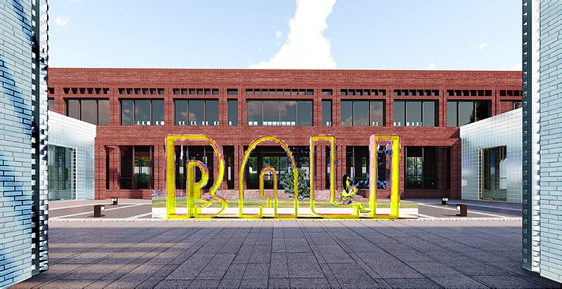
北京东升凯莱酒店位于中关村东升科技园内,由原有两栋相距50多米的职工宿舍楼改扩建而成。本项目的建筑、景观和室内设计均由园区的总体设计单位------北京清石建筑设计咨询有限公司担纲。酒店以紫气东来这个典故为设计引言,一方面契合了东升凯莱酒店的名称,另一方面也藉此着力挖掘这个典故所蕴含的哲思意境,并与京城文化相结合,打造别具一格、难以忘怀的酒店环境。通过极富创新的平立面改造、加建设计,建筑、室内、景观完美的结合,相互为景,在极其有限的空间内展现了丰富的视觉层次,并且与园区内相邻的其他建筑相得益彰。贯穿于室内外的老北京主题鱼盆、水景,新旧建筑内匠心独具的差异化、高科技客房空间,位于屋顶的观景室内泳池,健身房,精心营造的阁楼spa空间以及茶室,无一不给客人带来惊喜及完美的体验。Beijing Dongshen Gloria Plaza Hotel, located in Zhongguancun Dongshen Science & Technology Industrial Zone, was renovated and expanded from two staff buildings with distance more than 50 meters. The architecture, interior and landscape of the project was taken by Beijing Qingshi Architecture Design and Consultancy Co., Ltd.. The hotel design was inspired by the Chinese allusion “the purple air comes from the east - a propitious omen appears”. It coincided with the hotel name and reflected the philosophical image of Chinese culture—especially Peking culture. An extraordinary and impressive hotel atmosphere was created. Through innovative flat façade renovation, creative expansion design, the architecture, interior and landscape are perfectly combined and interaction design indicates alluring visual impact also with the adjacent buildings. Stepping into the lobby and suite of the hotel, Peking culture shadows with waterscape and fish basins, the mixture of traditional buildings and modern buildings contrast, high-tech luxurious suite, roof swimming pool and gym, attic SPA and tea house, you feel infinite surprise and perfect experience.
Tingsongtang
听松堂
Fenghuangling Purong Health Management Center
凤凰岭蒲绒健康管理中心
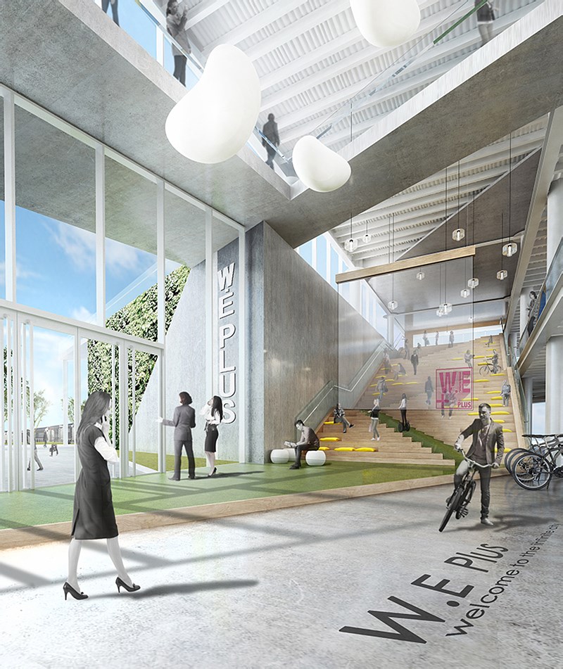
Beijing Economic Development“w.eplus city”
北京经开“W.Eplus之城”
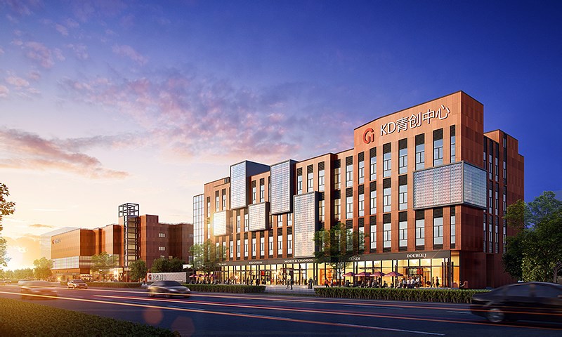
Beijing Tongxia Square Complex Project
北京通厦广场集合体项目
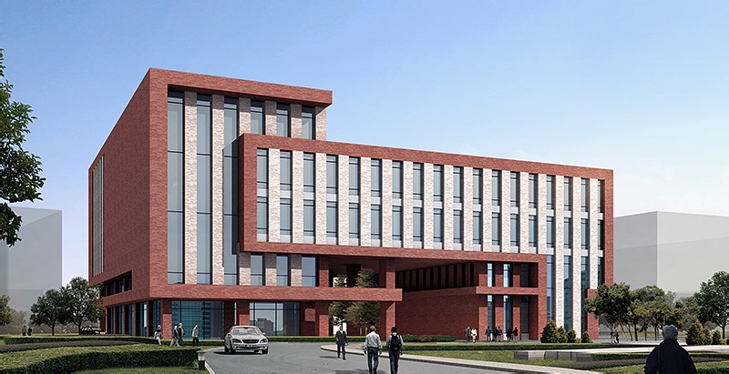
Capital Normal University Student Activity Center
首都师范大学学生活动中心
首都师范大学建于1954年,是国家“双一流”建设高校、北京市与教育部“省部共建”高校。学校现有学科专业涵盖文、理、工、管、法、教育、外语、艺术等,六十多年来已培养各类高级专门人才二十余万名,是北京市人才培养的重要基地。为了丰富学生的课余生活,培养“知识、能力、人格”三位一体的全面素质教育和复合型人才,现设计一所学生活动中心,以中国红为建筑主色调,合理运用自然光,创造舒适的空间体验
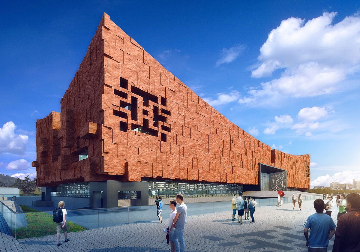
Chinese Qidan National Culture Museum
中国契丹民族文化博物馆
赤峰是文化大市,历史悠久、文化灿烂,契丹辽文化更是独树一帜。这里是契丹族的肇兴地,是辽王朝的发祥地,大辽王朝在我国历史上曾经雄踞中国北方200多年,全盛时期疆域面积达到760万平方公里,在这期间曾创造了灿烂的文化,有着卓著的历史功绩。契丹文化是中国文化史中一个重要的组织部分,具有鲜明特色和不可忽视的历史地位。清石建筑的设计师意在遵循“形式随从功能”的前提下,力求探索“有意味的形式”从布置、排列、结构形式和建筑的设计风格都结合了契丹的民族文化
COPYRIGHT (©) 2025 QUCESS 清石官网. 京ICP备11010571号
扫描二维码分享到微信